A WIREFRAMED WEBSITE THAT WORKS
Once a customer gets curious about how you can solve their problem, they may come looking for more information.
This is where your website comes in.
A great website can be worth hundreds of thousands or even millions of dollars. The problem is too many brands are getting their websites wrong, and they don’t know why.
IT’S ALL IN THE WORDS
Most of us intuitively know our website is important so we pay somebody thousands to design it for us.
Inevitably, whoever designs our website is more concerned with colors, images, and “feel” than they are with the words we are using. And while colors and images and feel are fine, it’s words that sell things.
Your website needs to include words that sell.
At the StoryBrand marketing workshop, we take an hour or so at the end of the second day to put a handful of client websites on the big screen, and I offer custom feedback.
I’ve done this for thousands of brands and most of them are making the same mistakes.
Here are a list of avoidable mistakes you’re likely making on your website:
• You are using too much insider language
• You are using too many words in the header.
• The call to action buttons use passive language.
• The call to action buttons are not repeated down the page
• The images do not relate to the product or back up the words you’re using on the page.
• The language is cute or clever but not clear.
• The site does not promote a lead generator.
• You’re using a slide show so the text changes too fast and frustrates potential customers.
• The site tells your story rather than inviting customers into a story.
The biggest mistake clients make when it comes to websites is making them too complicated.
Most businesses need a website that serves a single purpose: it creates sales.
Creating sales may not be the main reason you are in business, but it is the main reason you will stay in business.
Your website should be a sales machine.
WIREFRAME A WEBSITE THAT WORKS
Sadly, when most people hire somebody to create their website, the designer asks them all sorts of personal questions. They ask what their favorite colors are, their favorite music, how and why they started the company, and so on.
These are the wrong questions to ask. This designer, sadly, thinks he or she is preparing you for a banquet in which you are receiving an award.
Your website is not a place for you to celebrate yourself. Your website is a place where you sell your customer a product that solves their problem and makes their lives better.
The right questions a designer should be asking are:
What is the problem you solve?
How does your customer feel after you solve their problem?
How does somebody usually buy your product?
Was there unforeseen value that was added to your customer’s life when you bought this product?
START WITH A WIREFRAME
If a marketer asks the right questions, they can create a site that uses words that move more of your products.
But let’s not have them lay out that expensive website just yet. Let’s start with a wireframe.
A wireframe is a long piece of paper (or digital page) that includes the text in a rough-draft drawing of what the website might look like.
After your designer does an intake, they should turn in a wireframe. The wireframe is going to allow you to review the site and perhaps even get feedback before you spend hard-earned money creating a permanent site.
Remember, words on a website sell products. It’s great if the site is beautiful, but without the right words, the site won’t sell anything.
Settle on the right words by creating a wireframe that works. Get it all down on paper before you design that site and you’ll thank me. The last thing you want to do is create and re-create a website a thousand times through a process of trial and error.
If there is a proven way to create websites that work, why don’t we just create one for ourselves?
HOW TO WIREFRAME A WEBSITE
Before you spend thousands to redesign your website, read all the way though this chapter and complete the exercises.
By the time you’re finished you will have a completed wireframe you can take to your designer.
No more wasting money on beautiful websites that don’t impact sales.
Nine Sections of a Website That Work
It is absolutely possible that a website can be a great work of art and also dramatically increase your sales. That said, too many businesses spend thousands on a website that, ultimately, is simply a great work of art and doesn’t affect their sales at all.
These people are proprietors of the arts. They might as well print out a copy of their website, frame it, have their so-called marketer sign it, and then hang it above their fireplace.
If you can create an artistic, beautiful website that still sells, that’s terrific. But in my view, the artistic statement is icing on the cake. I want your website to grow your business.
There are nine sections of a website that we’ve seen increase sales time and time again. Each of these sections are like hooks in the pond: the more of them you include, the more fish you will catch.
The sections of a website I will help you create are:
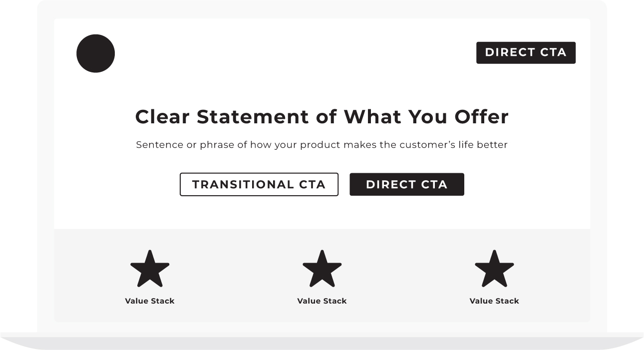
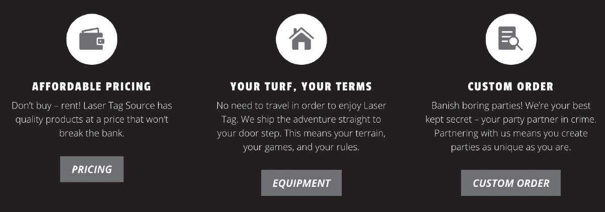
• The Header. The very top of your website, in which you use very few words to let people know what you offer.
• The Stakes. The section of the website in which you explain what you are saving customers from.
• The Value Proposition. The section of a website in which you add value to your product or service by listing its benefits.
• The Guide. The section of the website in which you introduce yourself as the brand or person who can solve your customer’s problem.
• The Plan. The part where you reveal the path a customer must take to do business with you and solve their problem.
• The Explanatory Paragraph. A long-form BrandScript in which you invite your customers into a story. This is also where you will improve your SEO.
• The Video (optional). A video in which you reiterate much of what was on the website in more dynamic form.
• Price Choices (optional): The divisions of your company or your list of products.
• Junk Drawer. The most important part of your website, because it’s where you’re going to list everything you previously thought was important.
What Order Do They Go In?
I often get asked, “What order would be put these sections in?”
With the exception of the header going at the top, there is no magical order. There are an infinite number of possibilities, and honestly, it’s pretty hard to screw up.
Think of designing of website like writing a song. Each section of the website is a different chord on the guitar. I am teaching you how to play the chords. How you use the chords, what order they go in, and how long you play them is up to you. Your job is to take these chords and make your website into a beautiful song.
At our marketing workshops, we go through a similar process. At the end of a couple short hours, the hundreds of businesses leaders in the room have wireframed a website that will work. After they wireframe these different sections, they can move them around intuitively to get the flow right.
Take a few hours and complete each section of your website. Try not to skip a section because you’ll be surprised at what you come up with when you give it a little time.
Also, make this a multiday process. Often I wireframe a website in phases. My first draft is just that, it’s a first draft. Then, after a night’s sleep, I see more clearly how I should structure my site.
With that, let’s get started with the fun part. Let’s wireframe the different sections of your website.
Section 1: The Header
You only get one chance to make a first impression. The header is the top section of your website and the first impression a customer has about your product or service.
You do not get two chances to make a first impression, so getting it right is important.
According to Chao Liu and colleagues from Microsoft Research, the first ten seconds a potential customer lands on the page are the most critical for users’ decision to stay or leave. (https://www.nngroup.com/articles/how-long-do-users-stay-on-web-pages/).
If your website survives the first ten seconds, users will look around a little bit longer. This, of course, translates into either building a relationship with a customer and growing your business or losing that relationship and allowing your business to decline.
Because you only have ten seconds (Liu also found the amount of time you have decreases every year), we are going to have to use words that pique our customers’ curiosity.
Again, what will pique their curiosity? They will get curious about you only if they think the products or services you provide might help them survive.
Does Your Header Pass the Grunt Test?
When we train our StoryBrand certified guides, we repeat over and over that cute and clever don’t sell products, clarity sells products.
Amateur copywriters and marketers try to make a first impression by branding themselves as cute, clever, or interesting. While there is nothing wrong with being cute, clever, or interesting, if cute, clever, and interesting come at the cost of clarity, you’ll lose.
To make sure your website makes a terrific first impression and piques your customers’ curiosity, make sure your header passes the grunt test.
What is the grunt test?
Passing the grunt test ensures your website speaks to the lowest common denominator about what you do well.
Remember, marketing is an exercise in memorization. That means you have to speak in simple, clear language. And that language needs to tell people how you can help them survive.
Imagine a caveman sitting in a cave by a fire. He’s a simple fellow, but not stupid. He’s busy defending his tribe, hunting for food for his family, and sewing the latest bearskin fashions so he fits in with his peers.
Let’s say in our imaginary universe the caveman could look at your website. But only for ten seconds.
Could that caveman grunt the answer to these three questions:
1. What do you offer?
2. How will it make his customer life better?
3. What does he need to do to buy it?
If a caveman can grunt the answers to these three questions, you’re on to something.
You don’t have access to a caveman, of course. But you do have access to lots of other smart, busy people who, because they are constantly filtering out information, will need to answer those three questions just as quickly.
When wireframing a website, in fact, we recommend going to a coffee shop and asking a couple people to take a look at your header. I know it’s uncomfortable to talk to a stranger, but whether or not a couple of strangers can say what you offer, how it will make their lives better, and what they can do to buy it could make or cost you millions.
Remember, clarity is the key.
Let’s look at each of the three questions that will allow you to pass the grunt test a little more closely:
Question 1: What Do You Offer?
What is the physical, tangible thing you are selling?
You’d be shocked at how many corporations don’t say what they sell right at the top of their website. Or, worse, they think they’re saying it but really they’re being elusive.
A financial advisory may offer “A path to a better future” without realizing that could be confused for a gym, a college, a church, or just about anything else.
Don’t use the header of your website to differentiate yourself from somebody else. Clarity itself is going to differentiate you—because your competition, I guarantee you, is being confusing.
Often, a client will try to explain what they offer in complicated, poetic language. But what their customer is really looking for is a short explanation of what they offer in layman’s terms.
What is your product or service?
• Lawn care
• Coaching
• Copywriting
• Clothing
• Haircuts and color
Take a minute and write down a clear and concise statement of what you offer.
[Your Notes]
Question 2: How Will It Make Your Customer’s Life Better?
Once you have clearly explained what you offer, let’s sweeten the deal.
If somebody buys what you offer, how will it make their lives better?
You don’t have space here to list a thousand ways that your product or service makes life better—even though that might be true. For clarity and brevity’s sake, you’ll have to choose the one most significant way your client’s lives will improve, and trust that choosing one will be remembered while listing many would be forgotten.
How does your customer’s life improve because they do business with you? Do they have more money? More time? A higher status in life? More peace? Better relationships?
You will have space later to expand on other areas you improve their lives, but for the purpose of the header, lets choose one.
[Your Notes]
Compile your answers to the past two questions into a single statement like one of these:
1. Injury lawyers committed to helping you get your life back
2. Great managers aren’t born, they’re trained: See how we do it
3. Transform your health, regain your life: a proven, drug-free path of healing for all of your unresolved health concerns
4. Surprise and delight your guests with handcrafted desserts
Your statement below:
[Your Notes]
Question 3: What Do They Need to Do to Buy It?
You’d be surprised how many people don’t have a “buy now” button anywhere on their website.
You can tell they’ve spent days, months, weeks, years even working to make their website functional and beautiful and make sure it represents them well.
Then they send their customers away without even asking them to buy anything.
The “buy now,” “schedule a call,” or “shop now” buttons are the cash registers of your online store.
Some business leaders don’t want to appear pushy. I understand the feeling. The last thing I want to do is strong-arm my customers into buying from me. That said, not having a clear call to action is the equivalent of telling customers you don’t really believe in your product and don’t think that product can solve their problems and change their lives.
Imagine walking through a clothing store and picking out several items you’d like to buy. When you walk to the front of the store to buy the items, though, you don’t find a person behind a cash register. You walk around the store wondering where you can buy the items before finally stopping to talk to a team member.
“Oh, we hate bothering people with all that corporate nonsense. We’re about so much more than selling clothes, you know.”
“Right, but I want to buy these things. How do I buy them?”
“Oh, that’s easy. There’s a lady who will take your money in the second stall of the lady’s bathroom. Like I said, we don’t want to appear too corporate.”
This interaction would be absurd, of course. And yet many online businesses treat their customers exactly this way. In the end, not being clear and direct in your calls to action comes off as either passive or self-obsessed.
What the customer really needs is a clear cash register so they know where to go when they decide to make a purchase.
If a user lands on your site and wants to purchase your product or service, what is the next step you want them to take?
Can they buy your product now? Do they need to be added to a wait list? Do they need to set up an appointment? Should they call? Register? Sign up? Donate?
Don’t Be Passive-Aggressive
Calls to action like “Learn more,” “Find out about us,” “Curious?” or “Our Process” are weak and confusing.
What a customer really needs is something to accept or reject. Until then, they are confused about what you want them to do or where you want this relationship to go.
Often we use passive language like “learn more” or “get started” because we don’t want to push people. We may use this approach because relationships with our customers are important to us and we want to make sure to position ourselves as friends.
Being friends with your customers is a great idea, but don’t forget, this is a business relationship and business relationships are, by nature, transactional. And there is nothing wrong with a transactional business relationship.
You certainly want to be kind and respectful to your customers and even friendly, but in the end, trying to be their friend while passively trying to get them to buy from you is just creepy.
Make your intentions known early and often. Use a strong call to action.
Below, list how I can purchase your product. What is your call to action button going to say?
[Your Notes]
Where Does Your Call to Action Button Go on the Website?
When visitors land on your desktop website, their eyes read your page in either a Z pattern or an F pattern. Different studies have revealed different patterns, but regardless, visitors’ eyes do not move randomly across the page.
We teach our marketers to place important text and important calls to action along the path that the human eye travels when glancing at a website. Meaning, their eyes are drawn to the top left of the website first, then scan across to the top right, then diagonally down and across the middle of the page to the bottom left and then back across to the bottom right.
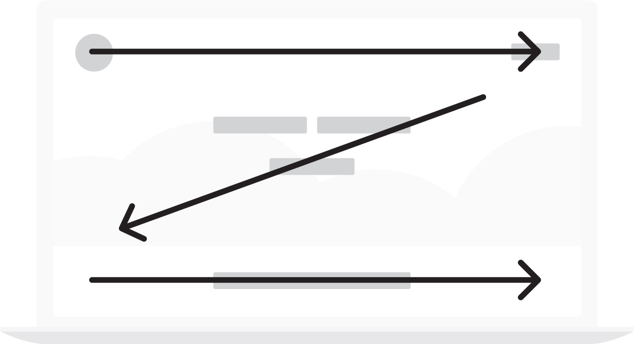
There are two places we recommend placing direct and transitional calls to action. The first is at the top right of the page, which is by far the most valuable real estate on your webpage. The second is directly in the middle of the header beneath your headline and subtitle.

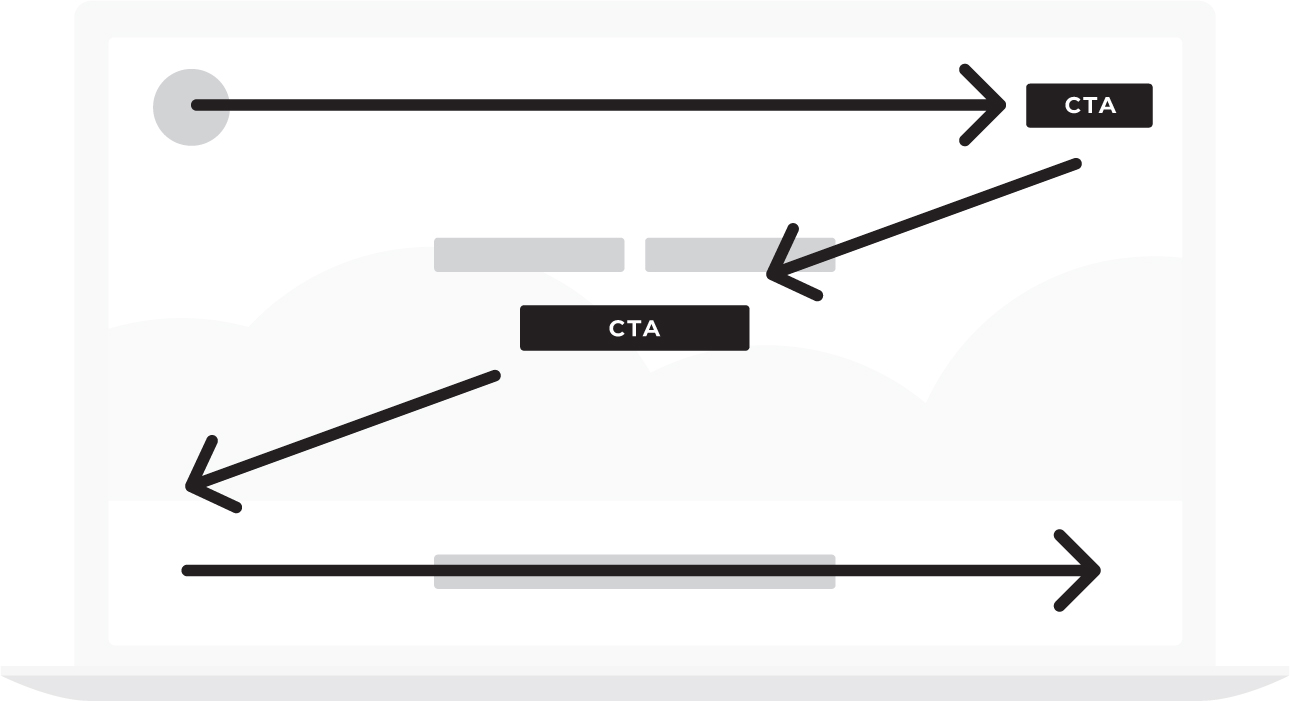
By repeating the call to action twice, even in the header, you will be letting your customer know that you are:
1. Interested in establishing a business relationship and
2. You’d like to solve their problem by selling them a service or product.
Many people reading this book will dramatically increase their sales by getting rid of passive language on their website and replacing it with direct calls to action.
Choose Your Images Carefully
While your wireframe won’t have any images, you’ll want to choose your images carefully.
Few images work better than smiling, happy people enjoying your products. So if you can’t figure out what images to use, smiling happy people are a good place to start.
Avoid creating a slide show in your header in which different text and images continuously change. Customers rarely have time to read one message before it’s changed to another, and after about three of these sliding messages, they tend to forget all of them.
Looping images (silent film) are terrific on websites but make sure the text that floats over those images is fixed. Branding is all about repeating the same simple message over and over until your customers have it memorized. Sliding text, then, hurts rather than contributes to your branding effort.
Let’s Build Your Header
Let’s put the three components of the grunt test together and build the header on your new website.
Write out the headline for your header, plus a subtitle if you need one, and write your direct call to action in the empty boxes below.
In the parentheses, describe what image (or looping film) you’d like to use in your header. If you build playgrounds, show children enjoying playing on your equipment. If you bake cakes, show some of those beautiful cakes being decorated and happy customers picking them up and gazing at them in wonder. Don’t worry about taking pictures just yet. You’ll do that later. Right now, decide what kind of images would best sell your product or service and describe those images in the header.
Next, list your calls to action. Your actual website may include both direct and transitional calls to action (we will cover transitional calls to action in the next chapter), but for now, consider this a simple drawing toward your header.
Now it’s your turn. Fill in the box below.
Check your work.
Imagine walking down to the local coffee shop with the header you just sketched. If you were to tap the first person you see on the shoulder, show it to them, and give them ten seconds to look at the page would they be able to say what you offer, how it will make their lives better, and what they’d need to do to buy it?
If so, your header passes the grunt test.
If you get the header of your website right, you’re 50 percent done with your website. Yes, you have a lot of other sections to create, but that’s how important your header is. It’s up to 50 percent responsible for whether a customer spends any more time on your site and eventually makes a purchase.
Tomorrow morning, go back over your header. Fine tune the text and images. Survey a group of friends and perhaps even ask a stranger or two for feedback.
When you get the header right, your business has no choice but to grow!
From here on out, the order of the sections of your website matters a little less. If you structure your website in the exact order we lay out these sections, you’ll do fine, but it’s hardly necessary.
That said, I really love making the second section of the website illustrate the stakes. Showing what can be won or lost depending on whether I do business with you is a great way to add some drama into the story you are inviting customers to live.
Visit MarketingMadeSimple.com to download a free “blank” sales funnel you can physically create on paper. Work with your designer to execute your sales funnel or visit MarketingMadeSimple.com to hire a certified StoryBrand guide who can create a sales funnel for you.
Section 2: The Stakes
This is the Failure section. Stories love tension. A story without stakes is no story at all.
For example, let me tell you a story and you try to figure out how we can make the story a little better:
A young man wakes up in his Venice Beach apartment, opens the windows, and breathes in the fresh, ocean air. He makes a cup of coffee and sits down to read the morning paper. Just as he opens the paper, though, his best friend calls and lets him know that he and another group of friends are playing volleyball down on the beach.
The young man loves to play beach volleyball so he folds his paper and heads down to the beach. They play several games of volleyball, each ending in a tie when one of the guys says he’s getting pretty hungry. The young man let them know there is a new taco shop across the street and suggest they try it out. They walk over to the taco shop and, amazingly, tacos are buy-one-get-one free and so, together, they devour several of them . . .
Okay, technically, that’s a story. It’s a story about a guy who wants to play volleyball and then wants to eat tacos.
The problem is, it’s not a very interesting story. In fact, some of you read that story and wondered to yourself “when is this story going to get started?”
A story that fails to get started always has the same problem: there is no conflict!
A story gets started and hooks the reader the second the character experiences conflict.
In fact, most stories start with a character who wants something followed by a scene in which an enormous challenge is placed between where the character is and what the character wants. It’s the crossing of that distance that makes the story work.
If our hero in the above story were to walk down to the beach for a game of volleyball only to experience a terrible earthquake in which the beach opened up and swallowed the other team, we’d have a story!
If a positive scene followed by a negative scene is how enthralling movies work, then why not follow the same formula on our website?
The first section of the website told our customers what their lives could look like if they purchased our product or service. Let’s make the second section of our website speak to the current pain our customers are experiencing because they haven’t bought our products yet.
What Is the Cost of Not Doing Business With You?
What is it costing your clients to not do business with you?
When you help your clients understand how much it is costing them to live without your products, the perceived value of those products increases.
Years ago when I first started StoryBrand, I asked an outside consultant to look over our website and offer constructive criticism. The consultant I’d chosen had attended our workshops and was familiar with our messaging framework. After looking at our site, though, she said we weren’t following our own advice.
“What do you mean?” I asked.
“You talk about how important it is to include stakes, to demonstrate the cost of not doing business with you, but there isn’t a single mention of the stakes on your site.”
She then sent me a paragraph and told me to place it directly over the section of the website where we let people know how much the workshop costs.
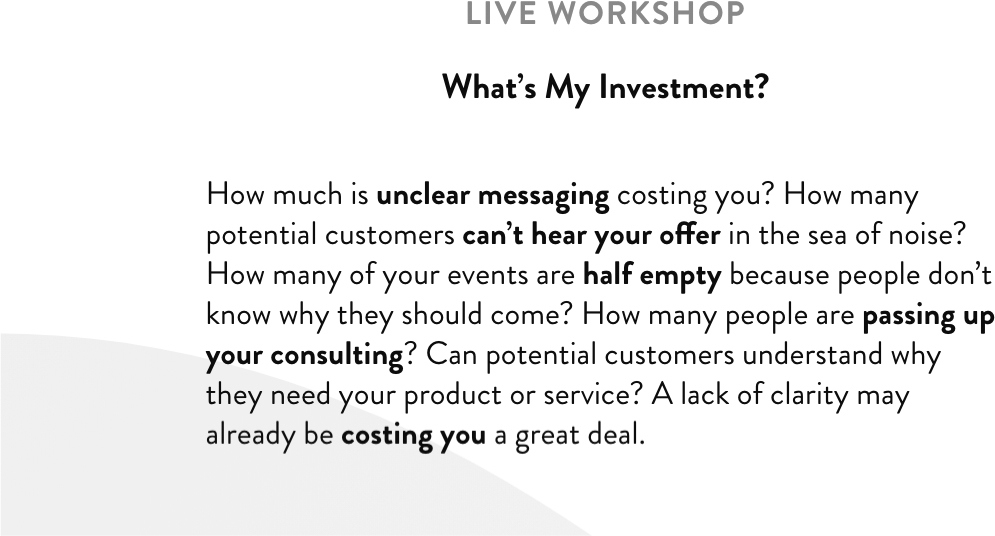
“How much is a confusing message costing you every day? How many customers are bouncing from your website? How many people are ignoring your brand? How many customers are you losing to the competition?”
I asked our designer to include the new paragraph but I didn’t feel good about it. I told my wife that night that it just didn’t sound like our voice. We don’t strong-arm customers into doing business with us. It’s not who we are.
Betsy, my wife, said that if it bothered me so much I should ask our designer to remove the paragraph the next day.
I walked into our designer’s office the next day and asked her opinion about the paragraph. She understood how I was feeling. It didn’t quite feel like our voice.
“However,” she said with a smile. “We did get five new orders last night!”
That paragraph is still on our site all these years later.
Why? Because story is a trustworthy guide. And if there are not stakes in a story, there is no story.
At our workshops, I teach that in a story there must always be pain and conflict, and yet when we talk about painful things in our marketing it can feel a little heavy. But don’t be tricked into telling a boring story. The stakes matter, and if you don’t let people know what pain you are helping them avoid you’ll lull them to sleep rather than stimulate them to place orders.
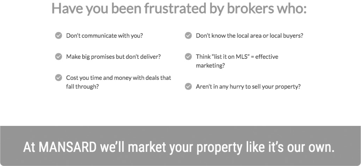
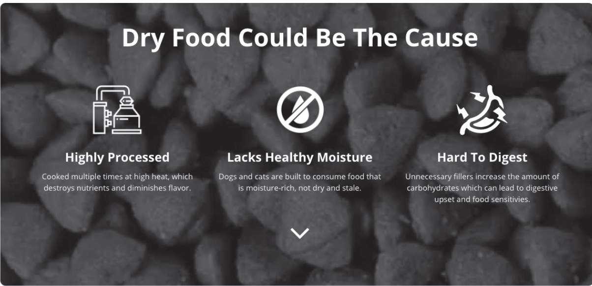
What pain are you helping customers avoid? What pain are they currently dealing with that will be ended if they buy your products or service?
Some examples are:
• More wasted time
• Missed opportunities
• Lost business
• Embarrassment
• Loss of sleep
• Frustration
• Weight gain
• Confusion
• Isolation
• Lack of access
• Lack of guidance
• Loss of status
• Not reaching potential
• Losing to the competition
When It Comes to Communicating the Stakes, Just a Little Bit Goes a Long Way
Unlike talking about our customers’ potential success, the negative stakes in the story we are inviting customers into can be overdone.
We definitely want to include negative stakes on our website, but don’t overdo it. When we get too negative, our customers will begin to tune us out. The brain is only willing to go so far before it decides it would rather live in a happy world, even if that world is a fictional construct.
I like to look at the components of a clear message like ingredients in a cake. To make a cake, you need cups and cups of flour (success) but only a tablespoon of salt (negative stakes). If you use too much salt, you ruin the cake, but if you leave it out, the whole thing tastes bland.
The singer Sarah McLachlan used to show up on television every once in a while as a spokesperson for the ASPCA. In her sweet, soft voice she’d talk about the plight of neglected and abandoned dogs while images of these adorable but sad animals slid across the screen.
When it comes to dogs, I’m about as sensitive as they come but even I couldn’t face that commercial. I’d always change the channel as fast as possible. My wife and I donate to our local dog shelter and have rescued a dog ourselves, but having to face those sad eyes was too much!
My guess is that commercial did pretty well for the ASPCA, but I also believe if they’d have shown happy dogs in a home with only a pinch of sad dogs being abused, they’d have done even better. After all, the purpose of negative stakes in a story is to contrast with the happy ending we all want to experience.
What Are You Helping Customers Overcome or Avoid?
Without overdoing it or exaggerating the stakes, what kinds of problems are you helping customers overcome or avoid?
Examples:
1. No more sleepless nights, tossing and turning on a mattress that doesn’t work for you.
2. Most people don’t realize how much time they’re wasting in their email inbox every day. We have a solution.
3. We meet people all the time who are wasting their money because they don’t know how to invest it.
4. Are you tired of paying money for marketing that doesn’t get results?
There are many ways to illustrate the stakes section of your website. You can include a few sentences describing the pain you help customers avoid, you can include a testimonial in which a customer explains how you helped them overcome a challenge, or you can simply list the problems you resolve in bullet points.
Here are some examples of stakes as they may appear on a website:
What pain or problems are you helping your customers avoid? List the pain points and challenges you resolve in the section below:
[Your Notes]
Again, you can be creative in how you illustrate the stakes on your website. Is it a checklist, a sentence, a series of questions, bullet points? Take a moment and sketch out what this section could look like.
Section 3: The Value Proposition
What could your customers life look like if they bought your product or service? Like I said earlier, from here on out you can put the sections of your website in any order you like. But one reason I like putting the value proposition third is because it follows the positive and negative flow we often see in stories.
Stories love to demonstrate contrasts. One character will be blunt and off-putting, and the character standing next to her will be kind and gentle. One scene will be visually dark and brooding, and the next will be bright and airy.
You’ll notice contrast the most, though, in the positive and negative movements of the screenplay. Every story has an obligatory or climactic scene that the narrative is heading toward. In this scene, which usually happens several minutes before the end of the film, all the conflict is resolved.
A Good Story Loves Contrast
If we deconstruct the screenplay backward from the climactic scene, we will notice that in one scene the hero moves closer to a positive climatic scene (the guy winning the girl’s heart, for example) and in the next, he experiences a setback (the girl flirts with the guy’s brother).
It’s this contrast that keeps the audience on their toes and paying attention. It’s as though the story works like this:
Scene one (+): Our hero really wants something.
Scene two (-): But the opportunity to get that something has been taken away.
Scene three (+): An opportunity arises that might help the hero get what they want.
Scene four (-): But that opportunity falls through.
Because these contrasting scenes have worked for centuries to captivate a human mind, let’s use them to captivate people browsing our website.
Again, the simple use of contrast (positive and negative messaging) on our website will suffice, but directly writing the first three sections so they vacillate from positive to negative to positive is going to give your message a familiar and attractive flow.
What Value Will Your Customer Receive if They Do Business With You?
Not only will the inclusion of a value section contribute to the contrast you’re inviting customers into, but it will also add a perceived value to your products and services.
For instance, if you’re selling your customer a maintenance package when they buy an HVAC system for their home, you’d increase the perceived value of that maintenance package if you listed a few benefits:
• Never worry about your air conditioner breaking down.
• Never have to schedule maintenance again.
• Breathe cleaner air without having to change filters.
Where some companies would simply mention they have a maintenance package, this company is “adding perceived value” to that package by listing other benefits the package gets me.
If the maintenance package costs $200 per year, and I perceive that package as being accurately priced and truly worth about $200, then saying I never have to worry about it breaking down increases the perceived value to, let’s say, $300. And never needing to schedule maintenance increases the perceived value to $350. Not only this, but breathing clean air all year is something I’d pay a premium for and so that raises the perceived value to something like $500.
Customers are much more likely to buy a $500 item if they can get it for only $200.
By using words, we just raised the perceived value of our products and gave our customer a much better deal.
How much would it cost you in overhead and supply to raise the value of your products by over 100 percent. You’d have to add a lot of gizmos and services to do that, right?
We just raised the value of our product by more than 100 percent simply by using words.
And words are free.
Tell Your Customer Everything They Get
For some customers, the bottom line question is What do I get in exchange for my hard-earned money?
In this section of the website, you’re going to tell them.
• Can they save money?
• Can they save time?
• Will they reduce risk?
• Are they getting quality?
• Will this help them simplify life or avoid hassles?
If so, this section of the website should spell out the added value.
Be Specific. Be Visual.
The biggest mistake people make when it comes to writing their value proposition is they aren’t specific enough.
If your product will help save your customer time or money, you want to say so. Avoid elusive language like “fulfilling” or “satisfied” and instead use specific language like “you’ll save time this summer” or “your lawn will make your neighbors jealous.”
It also helps to be visual. Of course the actual images you use in this section will help, but we can also use language that helps people “see, smell, and taste” the life they can experience.
“You’ll come home to a clean, fresh house that will make you feel like the queen’s own cleaning staff has come through your house.” Or “You’ll be wearing the tux you got married in within a few weeks!”
Can you see how this kind of language is more motivating than “Your house will be clean” or “You’ll lose weight”?
Here are a few examples of how other companies have illustrated the value they offer customers:
In the section below, list the value your products or service can deliver to a customer:
1. ____________________________________
2. ____________________________________
3. ____________________________________
4. ____________________________________
5. ____________________________________
6. ____________________________________
7. ____________________________________
8. ____________________________________
Include a Headline
Is there a common theme among all these problems? Is there one glaring header you could use to encapsulate the stakes?
Remember to always include a headline above each section. A website section without a headline is like a newspaper article without a headline. People will skip it.
Here are some example headlines that work great:
“Our customers no longer struggle with . . .”
“You don’t have to be confused anymore.”
“The stakes are high!”
“Act now and avoid the hassles.”
“Our heart breaks when we see people struggle with . . .”
With a header and a list of problems you help people solve, you’ll demonstrate both your understanding of your customers’ problem and your compassionate desire to help them find resolution.
Now, sketch out what this section of your website could look like below.
Section 4: The Guide
Help your customer win at all costs. At StoryBrand we certify existing marketing agents in both our messaging framework and our Marketing Made Simple checklist. At the end of their training, our StoryBrand guides take an oath. One of the agreements of that oath is that they will “obsess over their customers’ success.” By this we mean that they will not simply try to get money out of their customers but rather provide an incredible return on their investment.
The day you stop losing sleep about your own success and start losing sleep over your customers’ success is the day your business will start growing again.
Every hero needs a guide, and in this fourth section of the wireframed website, we’re going to position ourselves as the guide.
Again, these sections can go in any order. Now that you’ve established the first three sections as a positive, negative, and then positive movement in the story, your customers are likely hooked.
Not only are they hooked on the story you’re inviting them into, but because you’ve illustrated the stakes, they’re in desperate need of help.
A Guide Is Empathetic and Authoritative
All good guides in a story exhibit two crucial characteristics. They understand the challenges their customers are experiencing and they have been able to solve those challenges for other people.
At StoryBrand we call this empathy and authority.
To position yourself as the guide your customer needs, you need to express empathy and demonstrate authority.
When we demonstrate empathy and authority, our customer instantly recognizes we are the person who can help them win the day.
The One-two Punch of Empathy and Authority
Together, empathy and authority make a powerful one-two punch.
Imagine if you went to a fitness trainer and told them that you were interested in losing twenty pounds, toning some muscle, and getting on a healthy eating plan. Maybe you even explain to the trainer some of the problems you’ve been facing with your diet and weight loss plan—specifically that you crave ice cream late at night and that you have a hard time staying motivated to do any kind of cardio workouts.
Now imagine two different potential responses from the trainer. . . .
1. In the first scenario, the trainer tells you, “I feel your pain. I hate doing cardio too and could probably stand to lose ten pounds as well. Come to think of it, I also love ice cream. Maybe we should go get some together. I know this great place right down the street.” How likely would you be to pay this trainer any money?
2. In the second scenario, the trainer takes his shirt off and shows you how he can make his six-pack dance. He tells you he doesn’t eat crap like ice cream and launches into a spiel about how the latest research shows a diet of kale and cabbage is really the way to go, so you’re just going to have to suck it up and get that temptation out of your house. Again, how likely would you be to pay this trainer any money?
Empathy without authority falls flat, as does authority without empathy.
But it’s the guide who can empathize with your pain while also demonstrating a competency to get us out that we ultimately trust.
If the same trainer said to you, “I totally understand ice cream cravings. In fact, I used to really struggle with that too before I learned what I know now about regulating your blood sugar. I can teach you a plan I’ve used to help hundreds of guys just like you get in shape and feel really good about their bodies without losing all of the things they love about their life, ice cream included. And the cardio isn’t bad. Twenty minutes at a time. You can do this.”
That’s the trainer you want to hire.
In this section of your website, you’re going to clearly express empathy and demonstrate authority (or competency).
Here are a couple ways to communicate authority on your website:
• Testimonials. All testimonials aren’t created equally—below we will discuss testimonies.
• Logos of companies you’ve worked with. This works especially well for B2B.
• A simple statistic. Talk about how many people you’ve helped, how many years you’ve been in business, or how many clients have worked with you.
Examples:
• This is why we’ve spent the last twenty years helping clients just like you get in shape.
• Join the 100,000+ who have already changed the way they sleep at night.
• With our collected 100+ years of experience in the industry.
You don’t need much. Just a little authority does the trick.
Here are a few ways to communicate empathy on your website:
• Mention their primary pain point. Few messages are more endearing than “We understand how it feels to struggle with . . .”
• Testimonials in which customers state how much you cared for them are powerful.
• Stating plainly “I feel your pain” helped Bill Clinton become president and will help you grow your business.
Empathy
How can you resonate with your clients’ pain or problem?
We trust people who are like us, so you want to create a statement that shows you not only understand your customers’ pain, but you have felt it. You have been there before or experienced it through previous customers.
Here’s a trick: Complete this sentence: “we know what it feels like to ______________ .”
Examples:
• We know what it feels like to be overlooked for a promotion.
• We know how frustrating it is to have a great looking website that doesn’t result in sales.
• We know what it feels like to worry you’re not doing the right thing.
Now It’s Your Turn
What pain are your customers feeling? What problem is bothering them the most? And what single, short statement can you make to express the empathy you feel regarding their struggle? Feel free to use this section of the book as a rough draft and then transfer your results over to the paper wireframe you downloaded at MarketingMadeSimple.com to see it all come together.
[Your Notes]
Authority
How can you reassure your customer you have what it takes to help them solve their problem?
You don’t need to brag about yourself, but you do need a few key items that illustrate that you have the ability to help solve your customer’s problem because you have helped others.
When thinking through what type of authority you want to place on your website, make sure that the evidence of your authority directly relates to solving the problem your customer is facing. For instance, if you are a certified yoga instructor, but your business is lawn care, you do not want to put this on your website. This will confuse the customer. They will not have a category in their brains to put you in. Are you a yoga instructor or lawn care specialist? It would be better to put something like, “We’ve saved customers thousands of hours of working in their yards so they can spend more time enjoying it than working on it.” Only put authority on your site that directly relates to their success.
In this next section we will walk through each type of authority and what to consider in choosing what goes on your website.
Don’t Overdo the Authority
Be careful. If you communicate too much authority and not enough empathy, you will confuse your customer about who the story is about. Is it about you or them? Always make the story about them.
Express empathy and demonstrate authority through testimonials.
Including three or four customer testimonies on your website will greatly enhance your empathy and authority.
But most companies get testimonials wrong.
The main problem we see when our clients use testimonials is they are too long. And the second problem is they ramble.
When we train our StoryBrand certified guides, we ask them to listen for soundbites. We have them interview customers and report back to us on what they heard. Were there any soundbites that could be used to succinctly convince others to buy?
When collecting testimonials, you want to think of yourself as a news editor. If a television news station sends out a reporter to interview somebody on location, they likely come back with twenty minutes or more of footage. That footage is cut into soundbites that may last a few seconds. Why? Because not everything the interviewee says is actually interesting.
Here are a few different soundbites you can look for when collecting testimonials:
1. Overcoming objections. Look for (or ask for) testimonials that speak directly to a client overcoming the primary objections customers have about doing business with you. For example, “I worried this course was going to be a waste of time. I was wrong. I made more progress in six hours than I’ve made in ten years.”
2. Solving problems. Look for (or ask for) testimonials that speak to a specific problem you helped a customer overcome. For example, “I’m on my feet all day at work, so by 5:00 p.m. my lower back is usually aching. I wore XYZ shoes for the first time, and by 5:00 p.m. I felt like I could do another shift without blinking. I haven’t felt this good in ten years.”
3. Adding Value. Look for (or ask for) testimonials that help clients pass the payment threshold by speaking to how much value they received. For example, “I was skeptical at first because of the price. But I can’t tell you how glad I am I used XYZ lawn services instead of another company. I’ve never been so proud of my lawn.”
Keep Testimonials Short
Once you have the right testimonial, make them short and scannable. You can even write them for your customer and then send the testimonials to them for approval. I’m not saying make something up or lie, I’m saying that you might have heard them tell you how you changed their life and you will know how to write it better than they do. Put a couple short sentences together and send it to them for approval.
Your customers are not writers. And they are not marketers. You may think you aren’t a marketer either but even having read this far in your book, you know more than 90 percent of professional marketers out there.
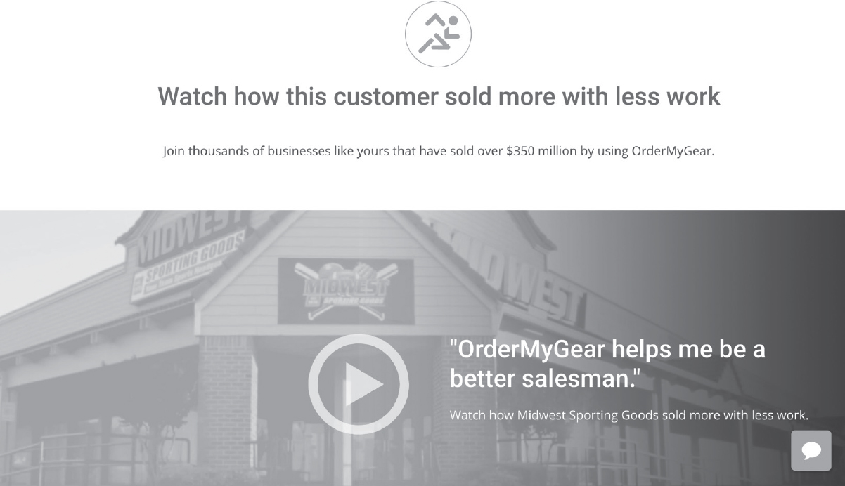
Use a Head Shot
Consider using a head shot of the customers so the testimonials have an even greater personal appeal and are more believable and relatable.
People trust others who are willing to publicly stand behind their words.
Unless you’ve got NDAs to deal with, use your customer’s name and image.
Now It’s Your Turn
Collect a few testimonials for your site. Feel free to use this section of the book as a rough draft and then transfer your results over to the paper wireframe you downloaded at MarketingMadeSimple.com to see it all come together.
Testimonial #1:
[Your Notes]
Testimonial #2:
[Your Notes]
Testimonial #3:
[Your Notes]
Including Images of Customer Logos on Your Site Adds Authority
Another way to demonstrate authority is to include logos from B2B interactions, or even logos of press outlets in which you have been featured.
The great thing about including logos is it doesn’t take up much room on a website and yet allows the person scanning your site to check off the “these people know what they’re doing” line item in their brain.
At StoryBrand we often get the question “But will it work for me?” To overcome this objection we put logos from a variety of companies on our site. We change our website from time to time, but we have featured logos from nonprofits, small businesses, national and international brands, large companies, and small companies. We also have a section that says “StoryBrand Works for B2B and B2C Companies.” Then we list all the different types of sectors that have gone through a StoryBrand workshop. This quickly gives authority while also overcoming a perceived objection that they’re the only company StoryBrand won’t work for.
You do not have to have logos on your website, but if you work with a variety of different customers this is a great space to answer the question “Do they work with companies like me?” Show a variety of logos to show the breadth of your work.
Now It’s Your Turn
What logos will you include on your website? Feel free to use this section of the book as a rough draft and then transfer your results over to the paper wireframe you downloaded at MarketingMadeSimple.com to see it all come together.
Logos
[Your Notes]
Including Statistics Speaks to the Authority You Have
Statistics can be another great way to demonstrate your authority. The kinds of statistics you want to share should quickly and clearly let people know they can trust you to solve their problem.
Here are some examples of statistics that demonstrate your competency:
• Number of years helping people (number of years in business)
• Awards you’ve won
• Number of clients you’ve served
• Number of hours you’ve saved your clients
• Amount of money you’ve made your clients
Now It’s Your Turn
What statistics will you include on your website? Feel free to use this section of the book as a rough draft and then transfer your results over to the paper wireframe you downloaded at MarketingMadeSimple.com to see it all come together.
[Your Notes]
Let’s Put the Guide Section Together
We’ve given you plenty of examples for the guide section on your website. But remember, this section does not have to be long and involved.
You don’t need to use each of these examples. If you don’t have testimonials, don’t worry. You can collect those and include them in the future. If you’ve not won awards, don’t worry. All you need to do is quickly express empathy and quickly demonstrate authority and then move on. Never forget, you aren’t telling a story about yourself here, you are inviting customers into a story. In that story, you play the guide, not the hero, so position yourself as the customers’ guide and then get back to inviting them into a meaningful story.
Here are a few examples of how the guide section on your website can look:
Now It’s Your Turn
Sketch out a guide section for your website. Feel free to use this section of the book as a rough draft and then transfer your results over to the paper wireframe you downloaded at MarketingMadeSimple.com to see it all come together.
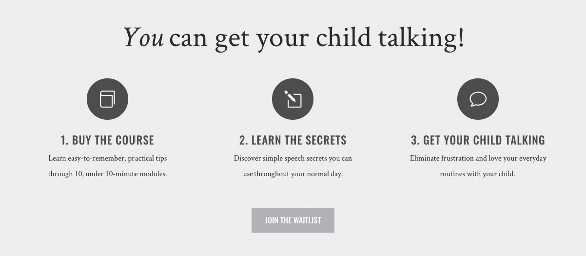
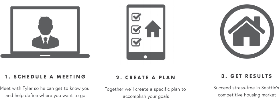
Section 5: The Plan
Pave a path for the customer and they will follow it. The plan section of your website tells customers what path they need to follow to do business with you.
By visually demonstrating what path your customers need to take, they see how easy it is to work with you and identify their next steps.
The reason we recommend a plan section is because people will not walk into a fog. If a customer is confused about what steps they need to take to buy your product or service, they will bounce from your site, using the excuse that they will come back later and figure it out. Of course we know they will not come back. They will likely never come back.
Although it may be obvious to you how a customer can buy your product or service, it is not obvious to them. Remember, customers are bombarded with commercial advertising and pitches every day and they will not spend mental bandwidth “figuring out the obvious,” no matter how easy the obvious is to figure out.
When customers are thinking about buying, give them a few simple steps they can take to engage your brand and buy your products.
Comedian Brian Regan has a bit in his stand-up about looking at a box of Pop-Tarts and seeing directions on how to eat them. He mocks the simplicity of the instructions and how this should be obvious to anyone who has ever eaten anything.
Does anyone really need to know a three-step process to eat a Pop-Tart?
Of course not. But all comedy aside, the “plan” is on the side of the box as a way to communicate to the unconscious mind of the consumer that getting to a successful result is even simpler than they thought. The visual representation of three steps, open the Pop-Tart package, warm the Pop-Tart, and then eat the Pop-Tart, actually says, “This is going to be easy. You’re going to have some sugar running through your veins in just a few minutes!” And that simple message translates into sales.
When you add a plan section to your website, it’s as though you’re saying to your customer, “It’s impossible to mess this up.”
Using Three Steps Is the Key
We recommend a three-step plan. You can use four if you like, but don’t go much past four. The more steps you have in your plan, the more complicated it looks visually and the less a customer will be willing to take the journey.
The reality is there may be seven or eight steps a customer needs to take to do business with you, but do yourself a favor and combine some of those steps into three phases. Having three steps keeps things simple and easy.
If you’re shopping for a caterer for an upcoming party, for example, you’ll be more likely to do business with a company that breaks down their process into three steps:
1. Tell us about your event.
2. Let us create a custom menu.
3. Host the party of your dreams.
Imagine searching for a caterer and their website simply said, “We will be your favorite, caterer, we promise,” but didn’t spell out a simple plan. Likely, you’d feel a little tension and confusion about how the process would work. Hiring a caterer and getting all that food to your house is involved, and because you don’t know how it works, you are more likely to pass in favor of a business in which you better understand the process.
Keep the Plan Visually Simple
You’ll want each step of your plan to be represented by a word or simple phrase. Remember, people scan websites before they read them so make your website easy to scan by putting key words in bold text or using bullet points for easy reading.
You can also use icons for each step, bolded headers, and short descriptions so the visitor doesn’t have to burn very many mental calories to figure out how you’re going to lead them to their successful result.
Exercise
Can doing business with you be broken down into three steps? What would those steps be? For instance, 1. Call 2. Plan 3. Build.
Below, write your three step process plan—how are you going to lead your customers to a successful result?
1. ______________________________
2. ______________________________
3. ______________________________
Now that you have the words that represent each step, you can use a sentence or two underneath the headers to further describe each step. In these short sentences talk about the benefits the customer will see if they take these steps or share any information that will make the process more clear.
For instance, if step one in the plan is to “set up a call,” what benefits will they receive from that call? Will it save them time, will they find out if they’re a good fit, will they get information they currently don’t have? If step two in the plan is to “get a plan,” will they stop wasting time, will they get your expert advice, with they have a clear path forward?
Each step of the plan should have a few words that discuss the benefits for the customer. Take a minute and brainstorm what benefits the client will get when they take each step?
Step 1 benefits.
[Your Notes]
Step 2 benefits.
[Your Notes]
Step 3 benefits.
[Your Notes]
Now put it all together. Sketch out below what the plan section of your website should look like. Use icons or numbers to represent the steps in the plan and then put the short descriptors underneath.
Now It’s Your Turn
Sketch out a plan section for your website. Feel free to use this section of the book as a rough draft and then transfer your results over to the paper wireframe you downloaded at MarketingMadeSimple.com to see it all come together.
Section 6: The Explanatory Paragraph
We often hear from clients who worry that trimming their text to make it pass the “grunt test” means they won’t be able to answer all of their client’s questions, provide them with the necessary information—especially for products or services that are more complicated—or communicate everything they believe their clients need to know to do business with them.
As the landing page or website gets deeper, though, you can use more and more text.
Most people bounce from a website because there are too many useless words at the top. By designing your website the way we’ve recommended, your customer is already hooked. Because you’ve told them what you offer, how it can make their lives better, and what they need to do to buy it, we can further elaborate on your offer because your potential customers are willing to give us a little more time.
The Explanatory Paragraph Is Where Your SEO Will Come From
If you are worried about search engine optimization (SEO) on your website, the explanatory paragraph is going to ease your fears. While SEO algorithms change often, simply including long-form text using words that sell your products is going to help.
In addition, including a long-form explanatory paragraph allows customers to feel like they’ve done due diligence in researching whether or not to buy your product or service.
Most people don’t like to buy impulsively. They have a healthy regulator in their brain that wants to check off a few boxes that make them feel as though they’ve done a little research. For most potential customers, your explanatory paragraph will scratch that itch.
Still, the explanatory paragraph is easy to mess up. If you ramble on and on about the history of the company and how proud you are of your accomplishments, you’ll waste your customers’ time.
What your customer really wants is to be invited into a story. And your explanatory paragraph is going to accomplish exactly that.
Invite Customers Into a Story
If you’ve read my book Building a StoryBrand, you already know how to invite customers into a story. But if you haven’t, don’t worry. I’m going to share a quick and easy formula with you that will make the writing easy. I recommend following this formula word for word for your first pass, then nuancing it so that it feels true to your voice.
Your explanatory paragraph is going to do the following:
1. Identify who your customer wants to become.
2. Identify what they want.
3. Define the problem setting them back.
4. Position you as their guide.
5. Share a plan they can use to solve their problem (which includes your product).
6. Call them to action.
7. Cast a vision for their lives.
This magical paragraph is essentially a story your potential customers can lean into. And they will feel that as they read it.
Let’s look at the paragraph Mad Lib–style, then I’ll slowly explain each piece so you can fill it out on your own.
A Sample Explanatory Paragraph
At______________[your company name] we know you are the kind of people who want to be______________[aspirational identity. What kind of person do they want to become?]. In order to be that way, you need_____________________[As it relates to your product, what does your customer want?]. The problem is______________[What’s the physical problem holding them back?], which makes you feel______________[How is that problem making them feel?]. We believe______________________[Why is it just plain wrong that anybody should have to deal with that problem?]. We understand______________[Include an empathetic statement]. That’s why we______________[Demonstrate your competency to solve their problem]. Here’s how it works____________________________[What’s your three-step plan: step one, step two, step three]. So______________[Call them to action], so you can stop______________[What negative thing will happen or continue to happen if they don’t order?] and start____________________[What will their life look like if they do place an order?].
Write and rewrite your explanatory paragraph until it is smooth and makes sense. You’ll notice that what you’ve really done with this paragraph is created a mental map for your customer. After reading this paragraph, they suddenly know what’s been troubling them, how to overcome whatever has been troubling them, and what steps they need to take to move forward. Their world, as it relates to your product and service, now makes sense.
And remember, people move toward clarity and away from confusion.
I’ve had many, many clients tell me they went to my website and decided to make a purchase after reading the explanatory paragraph. What they’re really telling me is that they placed an order once my product started making sense and only after they felt like they’d done due diligence.
The explanatory paragraph is a great way to accomplish both.
Another Option for the Explanatory Paragraph: Overcome Your Client’s Objections
Another way to write your explanatory paragraph is to overcome customer objections.
Every potential customer who comes to your website has questions or fears about doing business with you. Your explanatory paragraph is an opportunity to overcome those fears and remove any hurdles that would keep them from doing business with you. Sometimes just overcoming one objection can lead to a sale.
To do this, you want to start by listing the top five reasons why someone would not want to do business with you.
What are the five excuses or questions you hear from customers who are unwilling to place an order?
These questions could be:
• The product is too expensive.
• I doubt it will work for me.
• What happens if it doesn’t work for me?
• I doubt the quality is as good as they’re saying it is.
• The process is going to take too long.
• I won’t know how to use it once I place an order.
• I’ve tried something like this and it didn’t work.
After you have listed the top five excuses, craft a sentence or two that overcomes each objection. For example, if the question is “Is the process complicated?” you could write a sentence that says, “We guide you through an easy process to help you use our product so you never have to worry about X again.”
If the question is “What happens if I’m not satisfied?” you could write “we have a 100 percent satisfaction money-back guarantee.”
Once you have those sentences written out, turn them into a paragraph that can go on your website.
Below, list the top five reasons why someone would not want to do business with you, followed by your response to overcome this objection.
Reason #1 __________________________________________
Response #1 ________________________________________
Reason #2 __________________________________________
Response #2 ________________________________________
Reason #3 __________________________________________
Response #3 ________________________________________
Reason #4 __________________________________________
Response #4 ________________________________________
Reason #5 __________________________________________
Response #5 ________________________________________
If you’d like to use both examples of explanatory paragraphs, feel free. Your customers can continue scrolling down your landing page forever. No landing page is too long, as long as the text and images are interesting. If you do use both explanatory paragraphs, just make sure to separate them by a few sections so your landing page doesn’t look like it contains too much text. When a customer sees a lot of text, they start thinking you’re going to make them work too hard to buy your product and they’re more likely to bounce. Never forget, your customer wants the process of buying and receiving your product to be easy. So even with these long-form paragraphs, don’t waste words.
Now It’s Your Turn
Write your explanatory paragraph (one or both types) in the space provided. Feel free to use this section of the book as a rough draft and then transfer your results to the paper wireframe you downloaded at MarketingMadeSimple.com to see it all come together.
Section 7: The Video
This is another opportunity to present your sales pitch. The next section of your website is where you will include the video. While you don’t have to include a video, we recommend creating one that repeats your message narratively and visually.
Many potential customers will simply scroll down to the video section without reading much of anything. For this reason, your video simply needs to repeat what’s already been said.
And even if they do read your page word for word, repeating those words in your video goes a long way in helping them memorize your offer.
Creating video does not have to be complicated. In fact, if you simply read your explanatory paragraph into a microphone and lay that text over “B-roll” of people using your product, you should be fine.
If you’d like to get a little more advanced, consider elaborating on your explanatory paragraph with customer testimonials or even a message from your CEO.
If you’re going to include a video, though, here are some rules we recommend following.
• Keep it short. Most experts say a commercial video on a website shouldn’t extend much beyond three minutes. I agree with that as a general rule, but of course if a video is interesting, it can go for five minutes or more. That said, though, I’ve rarely seen a five-minute video that couldn’t have been trimmed down.
• Hook the viewer: One study shows that 33 percent of viewers click away and move on after the first thirty seconds of a web video. Ensure you grab the viewer’s attention quickly. How? Make sure the first thing the viewer hears and sees is a problem. What problem do you solve for your customer? State it right out of the gate and move on from there.
• Consider giving a longer video away in exchange for an email: If a potential customer has given you their email address in exchange for watching a video, they will actually watch a great deal longer? Why? Because they’ve “invested” something and will take the video more seriously. If you have a longer video, like a fifteen- or twenty-minute TED talk, with useful and engaging information, consider giving it away in exchange for an email as a lead generator. That said, don’t post the entire video on your homepage. Create a separate landing page to deliver the longer video.
• Give your video a title. Many people simply post a YouTube link on their homepage and check the “video” box off their website to-do list. This is a mistake. Actually give your video a title that makes people want to watch it and then place that title in bold text above the play button for that video. You’ll find that the number of plays increases dramatically. Consider titles like “How we’ve helped thousands solve X problem” or “Here’s how our process is different.”
The general rule here is that your video should be a sales pitch. It should help you close the deal. Don’t make the mistake of being vague and elusive in your video, turning it into some sort of brand identity art installation. Your customer wants to hear your pitch in a concise, clear, and interesting form, and your video is a great opportunity to accomplish this.
Now It’s Your Turn
What will your video be called? What narration do you want over your video? What do you need to shoot in order to create a video? Write some thoughts below and consider creating a video an important project over the next few months. Feel free to use this section of the book as a rough draft and then transfer your results over to the paper wireframe you downloaded at MarketingMadeSimple.com to see it all come together.
Notes on Creating a Video:
[Your Notes]
Section 8: Price Choices
Let’s get to the bottom line. Many clients either have custom pricing or too many products to list prices on their website. Don’t feel like you have to list your prices.
But, if you’re working with products with a fixed cost, and you are willing to put those on your site, spell out the cost followed by bullet points of what the customer gets with each price point.
Also, if a customer clicks on one of the prices or products, that link should go to a page only talking about that specific product. To create that landing page, simply follow the exact same formula you’ve used on the main landing page, only make the text and images specific to that product.
In this way, you can have a complex tree of links and websites but continue using this clear methodology so that your customer never feels confused or lost.
When listing the prices of your products, we recommend having three different options. Even if you only have one product, consider packaging other items or services with that product so you can have three different price points. Why? Because customers like having options, and when you give them a few options, they are more likely to choose and purchase one.
If you are selling many products, simply list your bestselling products on your landing page here and then move into a more catalog-style layout when customers click “shop.” Or perhaps include divisions of your offering like “Men,” “Women,” and “Children,” and then use the three-price-point option on each product when you create those separate landing pages.
Speaking of three price points, many of our StoryBrand certified marketing guides have discovered that customers usually choose to buy the item featured in the middle. They don’t want the cheapest or the most expensive, but they do want good value.
Again, make sure to spell out what customers get with each price point and you’ll have much more success.
Here are a few examples of simple price options laid out on a website:
Now It’s Your Turn
What will the pricing section of your website look like? Feel free to use this section of the book as a rough draft and then transfer your results over to the paper wireframe you downloaded at MarketingMadeSimple.com to see it all come together.
Section 9: Junk Drawer
The most important section of your website. Because it’s where you’re going to put everything you previously thought was important!
Many websites feature too many buttons and options at the top of the page. We strongly recommend putting most of these options at the bottom of the website in what we call the junk drawer.
The reason you don’t want too many links at the top of the page is because you’ll cause a potential customer to experience decision fatigue. The most important links are for your direct call to action and your transitional call to action, which I’ll cover in the next chapter.
People will scroll to the bottom to find a link to employment opportunities, contact info, and even “about us,” so reserve the top of the page for those who aren’t yet committed to giving you much time.
Simply move the contact, FAQ, about, employment opportunities, and so forth to the bottom of the page so that if people want to find them, they can. Use your junk drawer to clean up the clutter!
Exercise
What are you going to include in your Junk Drawer?
[Your Notes]
Sketch out everything you will feature in your junk drawer. Feel free to use this section of the book as a rough draft and then transfer your results over to the paper wireframe you downloaded at Marketing MadeSimple.com to see it all come together.
LET’S PUT TOGETHER A WEBSITE THAT WORKS
While there can be many other sections on a website, these nine sections are the ones we consider to be critical. Hundreds of guides helping tens of thousands of businesses create websites that work can’t be wrong. If it works for other businesses like yours, it will work for you.
Now that you have all the different sections created you can lay them out in a way that feels right for you.
Use the sales funnel wireframe you downloaded at MarketingMadeSimple.com to wireframe your new website.
While there are many digital tools that allow you to create websites, I recommend using paper and pen to write all the text. Why? Because by handwriting the text you’re paying a great deal more attention to what you are saying and how many words you’re using. You also aren’t getting distracted by digital images that may look pretty but sell nothing.
In addition, wireframing a website on paper takes time. It’s a slower process, and you’re more likely to meditate on what you’re presenting. That time and focus is going to translate into increased sales.
Not only will you have spent more thoughtful time wireframing your website, but if you do bring your site to a designer, you’ll have already done the majority of the work.
If you’re using a StoryBrand certified guide, they will already know why you’ve laid out your website the way you have, but if you’re using somebody who isn’t familiar with our framework, don’t let them talk you out of wireframing your website using these exact tools. Again, we’ve proven that these sections of a website work terrifically to create and increase sales. Don’t be fooled by mood boards and motion graphics. This website framework will work!
After you wireframe your website, you will have completed the first two components of your sales funnel. You now have a one-liner and a wireframed website.
But that’s just the beginning. The real key to increasing sales is the process of collecting email addresses and sending out emails and sales scripts. That process leads to orders in an automated system.
Let’s move on to the third component of our sales funnel: the lead generator.