We will only see an increased engagement from customers if we implement our StoryBrand BrandScript in our marketing and messaging material. The BrandScript you’ve put together has to show up on websites, in e-mail campaigns, elevator pitches, and sales scripts. You must edit existing marketing materials and create new and better materials, then get those materials in the hands of potential customers.
To the degree that you implement your StoryBrand BrandScript is the degree to which people will understand why they need your products. The more we implement, the more customers will listen.
The more you execute, the more clearly you’ll communicate and the more your brand will stand out.
The third section of Building a StoryBrand gives both large and small companies tangible, practical steps they can take to apply their StoryBrand BrandScript. Whether you’re a mom-and-pop shop, a start-up, a personal brand, or even a multibillion-dollar organization, you’ll learn from the thousands of companies who have created and executed their StoryBrand BrandScript to see radical results.
START WITH YOUR WEBSITE
Most of us don’t have millions to spend on a marketing campaign, but that’s okay. These days we can get serious traction just paying attention to our digital presence. A great digital presence starts with a clear and effective website. Our website isn’t the only tool we need to motivate buyers, but it’s usually the one that does the heavy lifting. People may hear about us through word of mouth or social media, but they definitely go to our website to learn more. When they get to our website, their “hopes need to be confirmed,” and they need to be convinced we have a solution to their problem.
In short, we need a website that passes the grunt test and converts browsers into buyers.
KEEP IT SIMPLE
At our workshops we’ve reviewed thousands of websites, and most of them have succumbed to villainous noise. The days of using our website as a clearinghouse of information are over. Businesses were once able to post all the small print about what they do on their website, but the Internet has changed. Today your website should be the equivalent of an elevator pitch.
Your website is likely the first impression a potential customer will receive about your company. It’s almost like a first date. The customer simply needs to know that you have something they want and you can be trusted to deliver whatever that is.
Even if your company has grown because of word of mouth, a website full of noise can kill potential sales. Your website matters.
As we’ve helped our clients create great websites, we’ve come back to five things they need to include in order to see results. These five things are just the beginning of a marketing campaign, but unless we’ve got these five things working for us, there’s no reason to move on. Let’s just call these the basics.
THE FIVE THINGS YOUR WEBSITE SHOULD INCLUDE
1. An Offer Above the Fold
When people go to your website, the first thing they see is the images and text above the fold. The term above the fold comes from the newspaper industry and refers to the stories printed above where the newspaper folds in half. On a website, the images and text above the fold are the things you see and read before you start scrolling down.
As I mentioned earlier, I like to think of the messages above the fold as a first date, and then as you scroll down you can put the messages you want to share on a second and third date. But as we’ve talked about, the stuff you share on a first date should be short, enticing, and exclusively customer-centric.
My wife was recently gifted an online membership to some sort of cooking school in Seattle. A friend sent it to her as a thank-you for some work she’d done on their website. At first, Betsy was excited, until she went to the site. On the main page of the site (before she logged in), there was a beautiful picture of a carrot cake and beneath it some kind of inside joke about having something to eat while watching Game of Thrones. We didn’t get it. She scrolled down and clicked on a video, hoping it would explain what kind of thing she’d been given. Instead, the video featured a cartoon explanation of how the company got started. Somebody named Joe met somebody named Karen, who was friends with somebody named Todd, and they all loved cooking!
It wasn’t until my wife signed in and began exploring what the site offered that she got excited. She came to bed that night telling me about a certain kind of natural ingredient she could use to take the color out of liquor so all her cocktails would look clear. I didn’t understand why this was important until she explained that the sage from her garden would stand out more as it hung from the glass. “Oh, the sage,” I said. “They offer a service to help your sage stand out.”
“No,” Betsy said. “It took me a couple hours to figure it out, but the whole subscription is about these three fun friends in Seattle who are going to make me a pro in the kitchen!”
BINGO! Betsy said it. She said the very words that needed to be printed above the fold on their website:
“WE WILL MAKE YOU A PRO IN THE KITCHEN!”
One short sentence would have helped us understand what they offered and even given us words to use to help their business spread.
There is no telling how many customers that site is losing because they are making their customers work so hard to understand why anybody would need their service. My own wife, who now loves the site, would have bounced had she not been given a free pass.
The idea here is that customers need to know what’s in it for them right when they read the text. The text should be bold and the statement should be short. It should be easy to read and not buried under buttons and clutter. I recently went to the website for Squarespace and it simply said, “We Help You Make Beautiful Websites.” Perfect. They could have said a lot of things on their website, but because they know to keep messages short and relevant, they’re making millions.
Above the fold, make sure the images and text you use meet one of the following criteria:
• They promise an aspirational identity.
By offering to make my wife a pro in the kitchen, the school in Seattle could have let her know “what’s in it for her” by appealing to an aspirational identity. Can we help our customers become competent in something? Will they be different people after they’ve engaged us? Let’s spell it out clearly.
• They promise to solve a problem.
If you can fix a problem, tell us. Can you stop my cat from clawing the furniture? My car from overheating? My hair from thinning? Say it. We didn’t go to your website to read about how many company softball games you’ve won; we came here to solve a problem.
• They state exactly what they do.
The easiest thing we can do on our website is state exactly what we do. There’s a shop down the street from us called Local Honey, which would cause anybody to think they sell local honey. They quickly overcame this confusion, though, with a tagline that says, “We sell clothes. We do hair.” Gotcha. Local Honey sells clothes and does hair. I’ve now filed them away in the Rolodex of my brain and will remember them when I need new hair or new clothes.
Take a look at your website and make sure it’s obvious what you can offer a customer. Some of our clients do spell out their offer, but they spell it out in the middle of a paragraph that starts out, “We’ve been in business since 1979, committed to excellence and caring about our customers . . .” That’s all nice and sweet, but J. K. Rowling didn’t start her first Harry Potter novel with “My name is J. K. Rowling and for a long time I’ve wanted to write a book . . .” The fact that she always wanted to write a book wasn’t part of the actual Harry Potter story, and she was smart enough to know it. She got straight to the point. She hooked the reader. She was smart, and we can be smart too. An offer above the fold is a sure way to get a customer hooked on the story we’re telling.
2. Obvious Calls to Action
If you’re not sure what a call to action is, go back and read chapter 8 in this book. It’s important. For now, know that the whole point of your website is to create a place where the direct call to action button makes sense and is enticing. While we’re in business to serve our customers and better the world, we’ll be out of business soon if people don’t click that “Buy Now” button. Let’s not hide it.
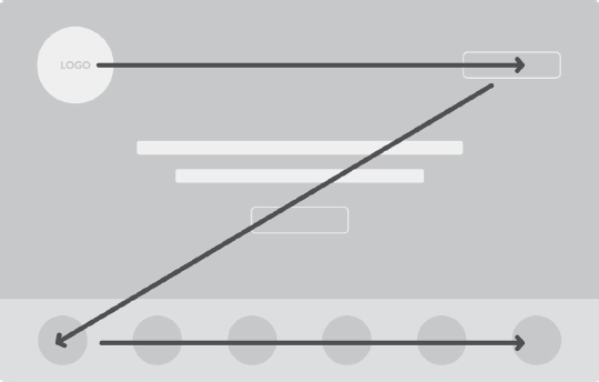
There are two main places we want to place a direct call to action. The first is at the top right of our website and the second is in the center of the screen, above the fold. Your customer’s eye moves quickly in a Z pattern across your website, so if the top left is your logo and perhaps tagline, your top right is a “Buy Now” button, and the middle of the page is an offer followed by another “Buy Now” button, then you’ve likely gotten through all the noise in your customer’s mind and they know what role you can play in their story.
For best results the “Buy Now” buttons should be a different color from any other button on the site (preferably brighter so it stands out), and both buttons should look exactly the same. I know this sounds like overkill, but remember, people don’t read websites, they scan them. You want that button to keep showing up like a recurring theme. A person has to hear something (or read something) many times before they process the information, so we want to repeat our main call to action several times.
Your transitional call to action should also be obvious, but don’t let it distract from the direct call to action. I like featuring the transitional call to action in a less-bright button next to the call to action so the “Will you marry me?” and “Can we go out again?” requests are right next to each other. Remember, if you aren’t asking people to place an order, they won’t.

3. Images of Success
Words make up the majority of our messaging, but not all of it. The images we use on our websites also communicate something. If people come to our website and see pictures of our building, we’re likely wasting some of their mental bandwidth on meaningless messages, unless, of course, you’re a bed-and-breakfast. But even then, images of the building aren’t what I’d lead with. I’d save that for the second date. We believe images of smiling, happy people who have had a pleasurable experience (closed an open story loop) by engaging your brand should be featured on your website.
Everybody wants to experience a better life in some way or another, and while it may seem simple, images of people smiling or looking satisfied speak to us. They represent an emotional destination we’d like to head toward.
Many of us need to display our products, but if we can feature those products in the hands of smiling people, our images might have more power. Not everybody needs to be smiling, of course; this wouldn’t seem authentic. But in general we need to communicate a sense of health, well-being, and satisfaction with our brand. The easiest way to do this is by displaying happy customers.
4. A Bite-Sized Breakdown of Your Revenue Streams
A common challenge for many businesses is that they need to communicate simply about what they do, but they’ve diversified their revenue streams so widely that they’re having trouble knowing where to start. If this is your struggle, you’re hardly alone. We had a client a couple of years ago that had two main products: a two-day personalized life-planning process for individuals and a two-day strategic operations planning session for teams of executive leaders. Sounds simple enough, except the company didn’t really make money off either product; instead, they made money training and certifying the facilitators. The challenge, then, was to increase demand for each product so that more people would want to become facilitators. This means they had to drive traffic to three different products: the life-planning product, the strat-ops product, and the facilitator certification.
If this company sounds like yours, the first challenge is to find an overall umbrella message that unifies your various streams. For our friends delivering life-planning and strat-ops facilitation, we chose the need people have for a customized plan. Above the fold on their website, we recommended the text “The Key to Success Is a Customized Plan” over an image of a facilitator mapping out a plan on a whiteboard for a satisfied client. As potential customers scrolled down the page, they would see two sections to choose from, personal life plans and corporate strategy plans. Each of these buttons led to new pages with messages filtered by two different BrandScripts. Customers were able to schedule facilitations on either page. The key to growing the business, though, was a button at the top and bottom of each and every page that said, “Become a Trained Facilitator.”
We may think our business is too diverse to communicate clearly, but it probably isn’t. Certainly there are examples where various brands within an umbrella company need to be split up and marketed separately, but in most cases we can find an umbrella theme to unite them all. Once we have an umbrella message, we can separate the divisions using different web pages and different BrandScripts. The key is clarity. When we break down our divisions clearly so people can understand what we offer, customers will be able to choose their own adventure without getting lost.
5. Very Few Words
People don’t read websites anymore; they scan them. If there is a paragraph above the fold on your website, it’s being passed over, I promise. Around the office we use the phrase “write it in Morse code” when we need marketing copy. By “Morse code” we mean copy that is brief, punchy, and relevant to our customers. Think again about our caveman sitting in his cave. “You sell cupcakes. Cupcakes good. Me want eat cupcake. Me like pink one and must go to bakery now.” Most of us err too far in the opposite direction. We use too much text.
Why say, “As parents ourselves, we understand what it feels like to want the best for our children. That’s why we’ve created a school where parents work closely with teachers through every step of their child’s education journey,” when you could just say, “Weekly Conference Calls with Your Child’s Teacher” as a bullet point along with five other great differentiators about your school?
As customers scroll down your page, it’s okay to use more and more words, but by more and more I really mean a few sentences here and there. Some of the most effective websites I’ve reviewed have used ten sentences or less on the entire page. That’s the equivalent of about ten tweets or one press conference with Bill Belichick.
If you do want to use a long section of text to explain something (we do it on our site, in fact), just place a little “read more” link at the end of the first or second sentence so people can expand it if they like, that way you aren’t bombarding customers with too much text.
As an experiment, let’s see if you can cut half the words out of your website. Can you replace some of your text with images? Can you reduce whole paragraphs into three or four bullet points? Can you summarize sentences into bite-sized soundbites? If so, make those changes soon. The rule is this: the fewer words you use, the more likely it is that people will read them.
STAY ON SCRIPT
These are the five most important things to do with your website. There are more, of course, but if you added all the rest of the tips and strategies together, they wouldn’t make as big of a difference as getting these five things right.
If you think about your StoryBrand BrandScript as a drum kit, think of your website as a drum solo. There shouldn’t be a single word, image, or idea shared on your website that doesn’t come from the thoughts generated by your StoryBrand BrandScript. The words don’t have to be an exact replica of your BrandScript, but the ideas should be the same. If you’re including messages on your website that don’t come from one of the categories of the StoryBrand 7-Part Framework, your customers will only hear noise.