16.11 Sass Control Structures
In the previous example, you created a kind of Sass template for buttons. Using control structures such as loops, you can automate the generation of CSS code for buttons in different colors. In the example, I want to use the @each loop for this purpose. This loop makes it possible to process a list of elements. With regard to the buttons, a list of color values should be used in the form of CSS keywords. This way you can create different buttons in different color schemes quite comfortably and with very little effort. Of course, this can be applied to any other element as well. I’ve highlighted in bold the changes to the /examples/chapter016/16_10/style/style.scss file from the previous section.
Table 16.14 The SCSS File and the CSS File after the Preprocessor Run
The shortened CSS file demonstrates in a clear manner how further selectors for buttons with the different color schemes .my-btn-blue, .my-btn-darkred, and .my-btn-darkgreen, along with the hover and disable versions, were generated from the color specifications in the list. The comma-separated list $btn-list is passed through in the @each loop. The $btn-default variable is a placeholder and contains the respective color name of the $btn-list. On the first pass, $btn-default stands for blue, on the second pass for darkred, and on the third pass for darkgreen.
To ensure that the CSS color names are also attached to the selector, the $btn-default specification was interpolated with #{}. On the first pass, .my-btn-#{$btn-default} becomes .my-btn-blue, on the second pass .my-btn-darkred, and on the last pass .my-btn-darkgreen.
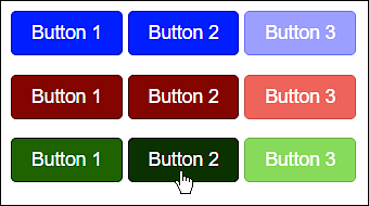
Figure 16.8 The HTML File /examples/chapter016/16_11/index.html with the Different Button Color Schemes during Execution
Admittedly, at this point, the example looks a bit more complex for starters, but it does nicely demonstrate that you can be extremely productive with Sass the deeper you get into it. Besides the @each loop, Sass provides other control structures as well.
In addition to the list-based loop @each, you’ll find the classic loop @for in Sass, which allows you to specify a certain number of repetitions for the code. The @for loop comes in two flavors:
for $counter from 1 through 10 {
   // Code which gets executed 10 times
   .my-class-#{$counter} {
       ...
   }
}
The loop is executed 10 times here. The current loop pass is stored in $counter. Due to the interpolation with #{}, 10 selectors (.my-class-1, .my-class-2, etc.) are generated here. Besides the option @for $ from [start] through [end], you can also use @for $ from [start] to [end] end here. With through, the final value is still executed, and, with to, the loop execution stops before it.
The @while loop is also available in Sass: such a loop is executed until the condition is false. However, you must be careful not to create an endless loop. Here’s a pseudo-code for that:
$counter: 1;
$reply: 5;

@while $counter <= $reply {
  // Code that is executed until the condition is false, here 1<= 5
  // Increasing the $counter variable by 1
  $counter: $counter + 1;
}
Here, the loop is repeated as long as $counter is less than or equal to the value of $reply. Increasing the $counter variable at the end is very important because otherwise you would have an infinite loop.
Besides loops, there’s also @if, which you can use to check a condition. The CSS preprocessor compiles a particular code only if the condition is true. To check conditions you can use different operators such as == (equal), != (unequal), > (greater than), < (less than), >= (greater than or equal), and <= (less than or equal).
In the following example, I’ve changed the btn-hover mixin. Optionally, you can now have buttons created without a hover effect if you pass a value other than 1 as a second parameter in addition to the color.
...
@mixin btn-hover($btn-color:orange, $hover-effect: 1) {
    @if $hover-effect==1 {
        $hover-color: saturate($btn-color, 10%);
        $hover-color: darken($hover-color, 10%);
        background: $hover-color;
        border-color: darken($btn-color, 20%);
    }
}
...
      @include btn-hover($btn-default, 0);
...
In this example, a CSS code block such as .my-btn-blue:hover {...} is only generated if $hover-effect is 1, which is the default value here.
Of course, there’s also an alternative @else branch that gets executed when the @if condition doesn’t apply. With regard to our example just shown, in the case of a disabled hover effect, the cursor should be changed to a stop symbol when you halt over the button with it. For example, you can use it to symbolize that this button can’t be pressed.
...
@mixin btn-hover($btn-color:orange, $hover-effect: 1) {
    @if $hover-effect==1 {
        ...
    }
    @else {
        cursor: not-allowed;
    }
}
...