16.8 Media Queries and “@content”
So that the mixins aren’t too much overshadowed after the extend section, I still want to bring the media queries into play here, for which mixins with arguments are again perfect: You can define the breakpoints as variables and adjust them at any time. It’s also useful that you can use inline media queries with Sass, which is an enormous help especially with extensive projects. The following example is intended to show how you can use media queries in Sass.
In this example, a mobile version (30em) and a desktop version (60em) were created. In the mobile version, the articles are displayed one below the other in the flexbox and side by side in the desktop version. In the created CSS code for the inline media query of Sass, you can also see that these media queries were created after compiling for each selector. This indeed means that there are a few more lines of code in the CSS file. But measured against the simplification and time saving of writing such media queries within the selector, the few bytes more than pay for themselves.
Besides the inline media queries, the use of variables with the mixins is also very useful, allowing you to customize the breakpoints quite comfortably. In addition, you can also apply arithmetic operators to the variables. I’ll go into this separately.
You can also see in this example at display: flexbox that Sass also takes care of the browser prefixes.
Table 16.10 The SCSS File and the CSS File after the Preprocessor Run
In the example with the mixin breakpoint, I still smuggled in @content, which works a bit like magic here:
...
@mixin breakpoint($mq-width) {
    @media screen and (
        min-width: $mq-width) {
        @content;
    }
}
...
As the name @content already describes, you can insert a content (into a mixin) with it. This instructs the CSS preprocessor to insert the contents of the subsequent SCSS code block at this point when compiling.
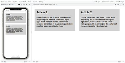
Figure 16.6 Example in Execution: The Mobile Version and the Desktop Version in the Blisk Web Browser