15.2 Viewing Websites in Different Sizes
In addition to testing websites in different web browsers and validating CSS and HTML code, you should also view the website on screens of different sizes. If you’ve developed a website that responds to viewport width with media queries, you can also track a layout break to the next smaller or next larger viewport using the desktop browser by manually changing the browser width. In practice, however, this is somewhat inconvenient and imprecise in the long run.
For viewing websites in different sizes, almost all web browser manufacturers now offer their own tools for viewing websites in different sizes, some of which are integrated into the web browser:
-
Firefox
In Firefox, for example, you can find the Test Screen Sizes command in the Tools • Web Developer menu or use the keyboard shortcut (Ctrl) + (Shift) + (M) (Windows) or (Alt) + (cmd) + (M) (Mac), which also allows you to view the current web page in different screen sizes. -
Chrome, Edge
You can also find a corresponding tool in Chrome and Edge via the menu Display • More tools • Developer tools. Again, the keyboard shortcut (Ctrl) + (Shift) + (M) (Windows) or (Alt) + (cmd) + (M) (Mac) will get you there faster. -
Safari
In Safari, you must first enable the Developer menu via Safari • Preferences in the Advanced tab. Then, you’ll find the item Switch to “Responsive Design” mode in the Developer menu. The shortcut (Alt) + (cmd) + (R) will also get you there.
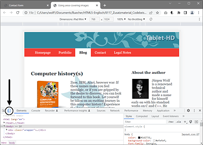
Figure 15.7 Testing Screen Sizes Using Google Chrome
My personal favorite tool to test a website on different devices and with different screen resolutions is the commercial web browser Blisk (https://blisk.io), which is completely based on Chromium. This browser includes tools that make testing desktop and mobile versions during development even more efficient.
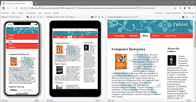
Figure 15.8 The Blisk Web Browser Allows You to Test a Website on Different Devices and Screen Sizes