15 Testing and Organizing
This chapter is more like a hodgepodge of different topics related to CSS and HTML. You’ll learn specific things you still need to know in regards to testing and organizing websites.
In this chapter, you won’t learn much about new features, but rather about techniques or tricks related to CSS and HTML that can be very useful. The following topics are described in this chapter:
-
CSS and HTML are constantly evolving, and not every web browser can handle all new features right away. Here, you’ll learn how to find out what a particular web browser is already capable of doing and what it isn’t.
-
Because there are more and more different devices and hence different screen sizes, here you’ll learn how to test and view websites in different sizes using online tools.
-
As projects get larger and longer, it can get confusing if you write everything in one CSS file. So, in this section, you’ll learn how to use a central stylesheet to keep track of large projects.
-
I’ll also describe the built-in style defaults of a web browser and how to reset or normalize all CSS defaults.
15.1 Web Browser Tests: What’s Possible?
Today, most visitors are using modern web browsers. When this book went into print, Google Chrome was enthroned at the top, ahead of Safari. The remaining percentage points were shared between web browsers such as Firefox, Edge and Internet Explorer, Opera, and so on, although Firefox enjoys somewhat greater popularity in Germany than in the rest of the world. If you’re serious about building websites, you’ll be testing your work extensively in all major web browsers and on different devices. At this point, the question might arise which browsers you should use for testing and which functionality a web browser actually brings along. You’ll get an answer to these questions in the following sections.
15.1.1 Validating HTML and CSS
The first step in testing a website should always involve validation. Many web browsers already provide a function for web developers to perform validation. Plug-ins are also often available for various browsers as well as HTML editors or development environments. Aside from that, the W3C with its online validator for HTML is available at https://validator.w3.org and for CSS at https://jigsaw.w3.org/css-validator.
At this point, it’s important to mention that a valid website doesn’t mean that it’s also perfect at the same time. Things like accessibility, usability, or speed won’t get better just because the HTML or CSS is valid. Consequently, those validators are also just another bunch of tools for quality assurance.
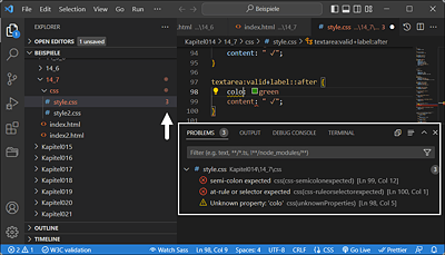
Figure 15.1 What’s Indispensable for Me Is a Validation of HTML and CSS during the Writing Process of HTML and CSS, Like Here with Visual Studio Code from Microsoft
15.1.2 Which Browsers Are Visitors Currently Using?
First of all, you might be wondering which browsers you should use for testing. Of course, it would be best to test with all browsers right away, but this already raises the question of feasibility, especially considering that most visitors are now using mobile devices. For this reason, it makes sense to first look at a few statistics about which browsers are most commonly used nowadays. You can find an interesting overview of this, for example, on the following websites: www.w3counter.com/trends, http://gs. statcounter.com, or https://www.statista.com.
Of course, you mustn’t make the mistake of generalizing these kinds of statistics. For example, if you put a website online that contains mostly Apple articles, you’re also likely to have mostly visitors with a Safari web browser. Then you’ll probably study the statistics afterwards anyway, when the website has gone online, to see what your visitors came to your website with.
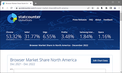
Figure 15.2 Web Browser Market in Germany
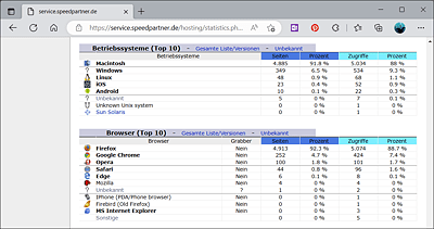
Figure 15.3 A Look at Your Own Statistics Then Reveals More Precisely What Your Visitors Really Use to Visit the Website
15.1.3 CSS Web Browser Test
Fortunately, modern CSS support is very good in all modern web browsers. To test the capabilities of the web browser with regard to CSS, there are several test systems available on the web. The advantage of those test systems should be that you can at least weigh up during the development of your website whether you should use a new CSS feature on your website at all or set up a fallback for certain web browsers that can’t handle it.
A more specific test for CSS features was developed by Lea Verou. You can perform this test online by entering the address http://css3test.com in your web browser. The latest web browsers currently manage around 50% to 67%, which isn’t bad at all. It’s also useful that the test lists the results for each individual area as well. Nice side effect of this test: you’ll discover many new CSS features and also immediate links to the corresponding entries of the specification.
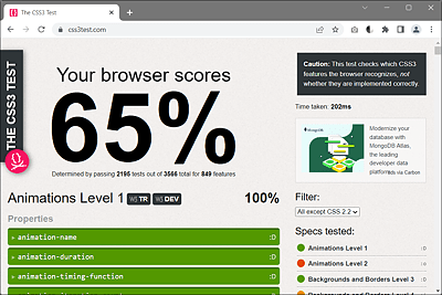
Figure 15.4 On https://css3test.com, You Get a Nice List of What the Web Browser Can and Can’t (Yet) Do in Detail
15.1.4 HTML5 Web Browser Test
As for CSS, you can find an interesting overview of what the web browser can do and what it can’t do (yet) compared to other web browsers in terms of HTML at https://html5test.com. Here, too, you’ll find the latest HTML features linked to the corresponding specification.
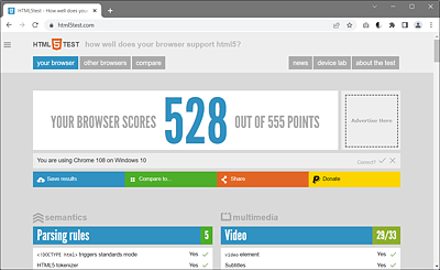
Figure 15.5 What the Web Browser Do in Terms of HTML
15.1.5 Can I Use That?
It’s not easy to keep track of the different web technologies and what you can use of them with which web browser. Especially with newer CSS and HTML features, it can become quite a tedious matter to test what already works on which web browser without web browser prefixes.
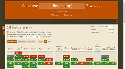
Figure 15.6 The Web Database www.caniuse.com Is Very Useful When It Comes to Determining Which Web Techniques Can Be Used with Which Web Browser
The web database at www.caniuse.com specializes in such cases and has proven its worth. The database takes into account the currently popular web browsers.
The website also features a very helpful continuing list of issues, notes, and resources on the topic you’re looking for. Searching for a topic is comfortable and easy thanks to a dynamic search function.
15.1.6 Feature Query Using the “@supports” Rule
You can check whether a particular CSS feature is supported by a web browser using the CSS rule @supports. This feature query is also referred to as a CSS feature query. Here’s an example:
...
@supports( hyphens: auto) {
  p {
    text-align: justify;
    hyphens: auto;
  }
}
...
Listing 15.1 /examples/chapter015/15_1_6/css/style.css
Here, we use @supports to check if the web browser understands the hyphens: auto feature. If that’s the case, the text in the p elements will be justified, and the CSS feature hyphens will be set to auto. You can use the CSS feature hyphens to enable the automatic hyphenation function of the web browser.
As an alternative, you can use the @supports rule with the not operator to check if the web browser doesn’t support a specific CSS feature. For example:
@supports not( display: grid ) {
  /* CSS features in case the browser does not know display: grid */
  float: right; /* e.g. float: right as alternative */
}
You can also combine multiple CSS features by using and and or. Moreover, @media and @supports rules can be nested. Web browsers that don’t understand the @supports rule will ignore anything inside the curly brackets.