13.6 Calculations Using CSS and the “calc()” Function
Sometimes, it can be useful to have the individual specifications calculated and displayed depending on the media feature. In CSS, you can use the calc() function for this purpose, which allows you to perform the basic arithmetic operations, addition (+), subtraction (-), multiplication (*), and division (/). When doing that, you can also mix units and, for example, multiply pixels by a percentage. It’s also important to know that the plus and minus must be preceded and followed by a space, which isn’t necessary for multiplication and division operations.
To demonstrate the use of calc(), we’ll create a simple layout grid with eight sections. In the standard version for screens larger than 640 pixels, four sections are to be distributed in a row (4 × 2). For screens that are less than 640 pixels wide, a layout break is supposed to be applied, with only two columns per row (2 × 4). At each layout break the number of columns is recalculated to fit the width. For this purpose, the .column class is used in the following example. If the screen width is less than 480 pixels, one column per line will be used (1 × 8). However, the example is only intended to demonstrate calc() in practice, and should in no way be taken as a recommendation for creating layouts. Flexboxes and CSS grids are a much better solution for that. Here’s the corresponding example:
...
.column {
  float: left;
  padding: 10px;
  width: 90%; /* For browsers without calc() support */
  width: calc(100% / 4);
}

@media screen and (max-width: 40em) {
  .column {
    width: calc(100% / 2);
  }
}

@media screen and (max-width: 30em) {
  .column {
    width: 100%;
  }
}
Listing 13.25 /examples/chapter013/13_6/css/layout.css
The corresponding HTML code looks like the following:
...
<section class="column">…</section>
<section class="column">…</section>
<section class="column">…</section>
<section class="column">…</section>
<section class="column">…</section>
<section class="column">…</section>
<section class="column">…</section>
<section class="column">…</section>
...
Listing 13.26 /examples/chapter013/13_6/index.html
In the following figures, you can see how calc() is used to calculate a new layout grid at each layout break. Only the .column class is used here.
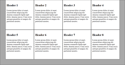
Figure 13.51 A Four-Column Layout with “width: calc(100% / 4);” for a Viewport of More Than 640 Pixels
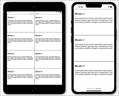
Figure 13.52 A Two-Column Layout with “width: calc(100% / 2);” for a Viewport of Less Than 640 Pixels (Left) and a Single-Column Layout with “width: 100%;” for the Viewport of Less Than 480 Pixels (Right)
Of course, the areas of application for calc() go far beyond this example. For instance, it can also be used for absolute positioning on the screen or automatic adjustment of individual elements within the parent element. You can even calculate a flexible adjustment of the font size using calc().