7.7 Interactive HTML Elements
HTML also provides elements for interactive content. Interactive elements can be changed and adjusted by visitors or can be interacted with in other ways.
7.7.1 Expanding/Collapsing Content Using <details> and <summary>
The details element allows you to expand and collapse page content. This can be useful if there’s too much detail and information at once, and you don’t want to overwhelm visitors with it. They can then expand and collapse the additional information by clicking on a summary element. Until now, such a task had to be implemented with JavaScript.
Let’s look at a simple example:
...

   Lorem ipsum dolor sit amet ...
   <details>
     <summary>More information</summary>
     <blockquote>Lorem ipsum dolor ... </blockquote>
     </details>
   <details open>
     <summary>Further information</summary>
     <ul>
       <li><a href="#">Link 1</a></li>
       <li><a href="#">Link 2</a></li>
       <li><a href="#">Link 3</a></li>
     </ul>
    </details>

...
Listing 7.27 /examples/chapter007/7_7_1/index.html
We’ve written the section for expanding and collapsing between <details> and </details>. You can specify the clickable area as a heading, which is always displayed between <summary> and </summary>. Clicking on this summary element will expand and collapse the content. If you don’t use a summary element, the default heading is usually just Details. In the example, you can therefore use the headings More information and Further information to expand and collapse the content hidden by them up to the end of the details element.
In the example, I also used the standalone HTML attribute open for the second details element, which you can use to specify that the content of this details element is expanded upon loading of the web page. By default, the content of the details element is always collapsed. All current web browsers can handle the details element. If the details element isn’t supported by a web browser, everything will be completely expanded, and no further interaction will be displayed.
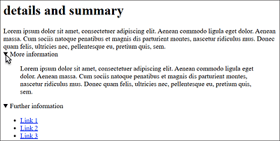
Figure 7.31 Expandable and Collapsible Content with <details> and <summary>
7.7.2 A Dialog Box via <dialog>
Dialog boxes or on-the-fly popups have been and still are primarily implemented using div elements. But there’s also a separate HTML element available for this purpose: <dialog>. Let’s look at a simple example:
...
  <dialog id="dialog1" open>
    <p>Exit dialog?<br>
      <input type="button" value="Close"
             onclick="document.getElementById('dialog1').close()">
    </p>
  </dialog>
...
Listing 7.28 /examples/chapter007/7_7_2/index.html
You can define a dialog in the space between <dialog> and </dialog>. The open attribute allows you to specify that this dialog gets displayed immediately upon loading. By default, without open, the dialog doesn’t display. Otherwise, the dialog element has no further attributes and only becomes meaningful in interaction with JavaScript. In the example, the dialog box can be closed via a button when clicking (onclick). For this purpose, we’ve addressed the ID name of the dialog with getElementById('dialog1') and closed it with close().
In addition to close(), you can also use show() here to display the dialog, or you can use showModal() to display it while everything else is grayed out. Usually, these JavaScript methods are activated by other elements because by default a dialog box without the open attribute isn’t visible at all at first. But let’s not get too much into JavaScript at this point.
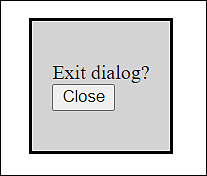
Figure 7.32 A Simple Dialog Box with the HTML Element <dialog>
The Safari browser can’t handle the dialog element yet. In Firefox, the element must be optionally enabled. Web browsers that can’t handle the dialog element display the full content, and interaction such as closing the dialog isn’t possible.