Informative Workspace
AUDIENCE
Whole Team
We’re tuned in to our progress.
Your workspace is the cockpit of your development effort. Just as a pilot surrounds themselves with information necessary to fly a plane, use an informative workspace to surround team members with information necessary to steer their work.
An informative workspace broadcasts information into the team room. On in-person teams, when people take a break, they’ll sometimes wander around and stare at the information surrounding them. That brief zone-out can result in an “aha” moment of discovery.
On remote teams, it’s harder to get the same “always visible” effect, but the same principles apply. Create opportunities for people to absorb information without having to consciously seek it out.
An informative workspace also allows people to sense the team’s progress just by walking into the room—or logging in, in the case of a virtual team room. It conveys status information without interrupting team members and helps improve stakeholder trust.
Subtle Cues
The essence of an informative workspace is information. An informative workspace constantly broadcasts information to the team. This takes the form of “big visible charts,” as described next, but it also takes the form of subtle cues that allow team members to maintain their situational awareness.
One source of situational awareness is seeing what people are doing. In a physical team room, if someone’s changing the visual plan, they’re probably thinking about upcoming work. If someone’s standing by the task board, they’re probably open to discussing what to work on next. By mid-iteration, if half the cards on the task board aren’t done, the team is going slower than expected.
The feel of the room is another cue. A healthy team is energized. There’s a buzz of activity in the air. People converse, work together, and make the occasional joke. It’s not rushed or hurried, but it’s clearly productive. When a person or a pair needs help, others notice, lend their assistance, then return to their tasks. When someone completes a task, everyone celebrates for a moment.
An unhealthy team is quiet and tense. Team members don’t talk much, if at all. It feels drab and bleak. People live by the clock, punching in and punching out—or worse, watching to see who is the first to dare to leave.
In a remote team, these cues are lost. Instead, make an extra effort to communicate status and mood. Establish working agreements around sharing information, such as leaving notes in the group chat and providing ways to check in with one another.
An informative workspace also provides ways for people to communicate. For in-person teams, this means plenty of whiteboards around the walls and stacks of index cards. A collaborative design sketch on a whiteboard can often communicate an idea far more quickly and effectively than a half-hour presentation. Index cards are great for retrospectives, planning, and creating visualizations.
For remote teams, the team’s virtual whiteboarding tool serves the same purpose. Some teams also establish one or two shared documents as the team’s “wall” of useful information. You can also improve your situational awareness by keeping the virtual task planning board always visible on a separate monitor or tablet, so you notice when people make changes.
Big Visible Charts
An essential aspect of an informative workspace is the big visible chart, or information radiator. The goal of a big visible chart is to display information so simply and unambiguously that it projects information from across the room. Remote teams can achieve a similar effect by using a single virtual whiteboard to represent their “room.”
The task planning board (such as Figure 9-1) and visual planning board (such as Figure 8-4) are ubiquitous examples of big visible charts. You’ll see variations of these boards in every Agile team, although many make the mistake of hiding them away in an issue tracker.
Another useful chart is a team calendar, which shows important dates, iterations, and when team members will be out of the office (along with contact information, when appropriate). For in-person teams, a large plastic perpetual calendar works well.
I also like to keep the team’s purpose—its vision, mission, and mission tests—prominently posted. It tends to fade into the background after a few weeks, but it’s good to be able to point to it when needed.
Avoid the reflexive temptation to computerize your informative workspace. Your team needs to be able to change its process any time somebody comes up with a good idea. With flip chart paper, tape, and markers, the elapsed time from idea to chart on the wall is two or three minutes. In a physical team room, nothing else is as flexible or convenient. Electronic tools take longer and are limited by their programming. Don’t let them constrain what you can do.
Remote teams have to use electronic tools, of course, but they should also prefer tools that make quick changes and updates easy, rather than trying to automate. The basic cards, stickies, and drawing tools of your virtual whiteboard should be enough.
Improvement Charts
One type of big visible chart measures specific issues that the team wants to improve. Often, these issues come up during a retrospective. Unlike the planning boards or team calendar, which are permanent fixtures in the team room, improvement charts only stay up for a few weeks.
Create improvement charts as a team decision, and maintain them as a team responsibility. When you agree to create a chart, agree to keep it up-to-date. For some charts, this means everyone takes a few seconds to mark the board when their status changes. Other charts involve collecting some information at the end of the day. For these, collectively choose someone to be responsible for updating the chart.
Improvement charts are as diverse as the problems teams experience. The principle behind all of them is the same: they appeal to our innate desire for improvement. If you show progress toward a mutual goal, people will usually try to improve their status.
Consider the problems you’re facing and what kind of chart, if any, would help. As an example, Agile teams have successfully used charts to improve:
-
Amount of pairing, by tracking the percentage of time spent pairing versus the percentage of time spent working solo
-
Pair switching, by tracking how many of the possible pairing combinations actually paired during each iteration (see Figure 9-4a)
-
Build performance, by tracking the number of tests executed per second (see Figure 9-4b)
-
Support responsiveness, by tracking the age of the oldest support request (an early chart, which tracked the number of outstanding requests, resulted in hard requests being ignored)
-
Needless interruptions, by tracking the number of hours spent on nonstory work each iteration
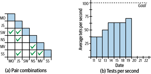
Figure 9-4. Sample improvement charts
Try not to go overboard with your improvement charts. If you post too many, they’ll lose their effectiveness. I try to keep a limit of two or three at a time, not including permanent charts such as the task board.
That’s not to say that your only decorations should be a handful of charts. Team memorabilia, toys, and works in progress are also welcome. Just make sure the important charts stand out.
Gaming
Although having too many improvement charts can reduce their impact, a bigger problem occurs when the team has too much interest in improving a number on a chart. They often start gaming the process. Gaming occurs when people focus on the number at the expense of overall progress.
A common example I see is when programmers focus too much on improving the number of tests they have, or amount of code coverage, rather than improving the quality of their testing approach. They make trivial tests that don’t have any value, or are difficult to maintain, or run slowly. Sometimes, they don’t even realize they’re doing so.
To alleviate this problem, use improvement charts with discretion. Discuss new charts as a team. Be clear about the overall improvement you want to see. Check in on whether they’re working every week and take them down within a month. By that time, the chart has either done its job or isn’t likely to help.
Above all, never use workspace charts in performance evaluations. Don’t even discuss them outside the team. People who feel judged according to their performance on a chart are much more likely to engage in gaming. See “Management” for ideas about what to do instead.
Questions
We need to share status with people who can’t or won’t visit the team workspace regularly. How do we do that without computerized charts?
First and foremost, the informative workspace is for the team. To share status with people outside the team, use stakeholder demos and roadmaps.
Our charts are constantly out of date. How can I get team members to update them?
The first question to ask is, “Did the team really agree to this chart?” An informative workspace is for the team’s benefit, so if team members aren’t keeping a chart up-to-date, they may not think it’s worthwhile. It’s possible that team members are passive-aggressively ignoring the chart rather than telling you they don’t want it.
Speaking from personal experience, it could be that you’re being too controlling about the charts. Dialing back the amount of involvement I have with the charts is often enough to get the team to step in. Sometimes that means putting up with not-quite-perfect charts or sloppy handwriting, but it pays off.
If all else fails, discuss the issue during the retrospective or a stand-up meeting. Share frustrations and ask for the team’s help in resolving the issue. Prepare to abandon some charts if the team doesn’t want them.
Prerequisites
If your team doesn’t have a team room, either physical or virtual, you won’t be able to create an informative workspace.
Informative workspaces are easy to create when you have a physical team room. Just put up the charts you want. If you have a virtual team room, you’ll need to put forth extra effort to make information visible and create situational awareness.
Indicators
When your team has an informative workspace:
-
You have up-to-the-minute information about all the important issues the team is facing.
-
You know exactly how far you’ve come and how far you have to go in your current plan.
-
You know whether the team is progressing well or having difficulty.
-
You know how well the team is solving problems.
Alternatives and Experiments
If you don’t have a team room, but your team has adjacent cubicles or offices, you can achieve some of the benefits of an informative workspace by posting information in the halls or a common area.
In terms of experiments, the sky’s the limit. The key to this practice is the cockpit metaphor: having all the information you need constantly visible, so you can automatically notice when things change and subconsciously realize when something is off track. Keep that in mind as you experiment with visualizations and posters. You can start experimenting right away.
Further Reading
Agile Software Development [Cockburn2006] has an interesting discussion in chapter 3, “Communicating, Cooperating Teams,” that describes information as heat and distractions as drafts. It’s the source of the “information radiator” metaphor.