Visual Planning
AUDIENCE
Product Managers, Customers
We have a map for achieving our purpose.
Your plan is the key to achieving your team’s purpose. Rather than saying “do this, then this, then that,” create a plan that allows you to visualize your choices and adapt your plans as you go. Visual planning is how you do so.
The possibilities for visual planning are endless. Here, I discuss four techniques. You can follow one of these techniques as written, mix and match between them, or create new visualizations that are wholly your own. The right visualization is the one that works for your team and its stakeholders.
Who Plans?
Visual planning is led by team members with product management skills, with the assistance of the team’s other on-site customers. Do your best to include key stakeholders, too, at least for high-level planning, and look for opportunities to include real customers. Their perspectives will improve the quality of your plans.
Developers can be heavily involved, or not, as your team sees fit. Some developers prefer not to attend yet another meeting—and, in truth, their time may be better spent elsewhere. On the other hand, developers’ work will benefit from an in-depth understanding of the plan, and their perspective often leads to better plans. I tend to leave it up to each individual developer to decide.
Even if developers don’t attend, they still need to understand the plan and provide feedback. Be sure to set aside time to discuss the plan with developers. The planning game might be a good time to do so.
Cluster Mapping
Cluster mapping (see Figure 8-4) is the simplest and most flexible way to visualize your plans, and also one of the most effective. It’s my go-to technique.
1. Brainstorm stories
To create a cluster map, start by reviewing your team’s purpose, then use simultaneous brainstorming (see “Work simultaneously”) to generate stories related to that purpose. You can create any stories you like, but keep them high level and avoid going into a lot of detail. You’re starting with the big-picture, long-term view.
For example, if your purpose is to improve conversion rates for your online shopping site, you might create stories such as “better mobile support,” “dedicated mobile app,” “curated product reviews,” “better check-out page,” and so on.
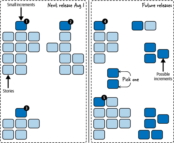
Figure 8-4. A cluster map
2. Cluster stories into increments
Once you’re done brainstorming, use affinity mapping to cluster the stories (see “Work simultaneously”), then divide the clusters into valuable increments (see “Valuable Increments”). Some stories will be valuable increments on their own; others will form a valuable increment when done together. For the latter, create a new story that represents the valuable increment as a whole.
Mark each story that represents a valuable increment. For physical cards, I like to use a fun sticker, like a star or smiley face. For virtual cards, I like to change the card color. The remaining stories can be kept or discarded depending on how useful you think they are.
3. Organize increments
Take a step back and think about the increments in the context of your team’s purpose, then reorganize them to better reflect how you think that purpose should be achieved. Some increments will be irrelevant, or too far in the future. They can be discarded or set aside.
Some increments could represent different ways of accomplishing the same result. If you’re not sure which choice you want to make, keep them both! Your plan is a map, and maps show multiple routes to a destination. You might even want to add some learning increments to help you choose between options.
You may have some increments that aren’t directly related to your team’s purpose but have to be done anyway. Add them to the board, too.
4. Review and refine
When you’re done, take a step back and review the map one more time, then tweak the clusters and add notes that make the map easier to explain. You want to be able to use the map as a visual aid to describe how your team is going to achieve its purpose.
At this point, you have a high-level plan showing possible increments that your team could work on. This is a good time to take a break and get feedback from team members, real customers, and other stakeholders who didn’t attend. Next, you’ll go into more detail.
Breaking Down Increments
As described in “How to Create Your Plan”, your overall plan will consist of multiple levels of detail. The visual plan involves these levels:
-
Purpose
-
Possible valuable increments
-
Smallest valuable increments
-
“Just right” stories
You started with your team’s purpose and used that to create possible increments. Now you’ll break them down further.
1. Brainstorm stories and cluster into small increments
Creating the smallest valuable increments follows the same process as creating your first set of possible increments, but it’s more focused. Starting with your most valuable increment, brainstorm stories needed to accomplish that increment, then cluster them to identify smaller increments that are still independently releasable and valuable. Create story cards for those small increments, as needed, and mark the cards that represent valuable increments. The original, larger increment can be kept or discarded, depending on whether you think the context it provides is useful.
For example, if your product is an online store and you have an “enhanced check-out page” increment, you could break it down into “remember credit cards,” “check out with PayPal,” “gift wrapping,“ “coupons,“ and so forth.
2. Filter and repeat
Next, filter the new increments and discard (or set aside) any that are irrelevant or too far in the future. Divide the rest into “highest priority” and “not highest priority.”
Repeat steps 1 and 2 until you have enough small, highest priority increments to fill your “smallest valuable increments” planning horizon. For example, if you use the planning horizons shown in Figure 8-2, you would stop when you had about three months’ worth of small increments.
NOTE
Just use your gut feeling about sizes. You’re not making a real estimate, just deciding when to stop planning, so err on the side of stopping too soon. The most important thing is to find the small increment your team will work on first. You can always break down more increments later.
Finally, look at the increments you haven’t broken down yet. Could any of them include small increments that are higher priority than the ones you already have? If so, break them down too.
3. Prioritize
When you’re done, take a step back and see if any new ideas occur to you. Then decide how to prioritize the small, high-priority increments. At a minimum, mark one to release first and another to tentatively do next. The remainder can be prioritized, or not, depending on your roadmap and forecasting needs.
If you’re using physical index cards, put the priority number on a small sticky note and stick it to the card. That way, when your priorities change, you can move the sticky notes without rewriting the cards.
That finishes off the “small increments” level of detail. This is another good time to take a break and get feedback.
4. Play the planning game
The final level of detail for your visual plan is to break your small increments into stories that are sized “just right.” Use the planning game to do so. When you’re done, you’ll have a set of stories for each of your highest-priority increments. Add each set to the board near its corresponding increment.
If you’re forecasting releases, you can add release dates to the board. The final result will look something like Figure 8-4.
Impact Mapping
Sometimes you want more structure than cluster mapping provides. Impact maps, shown in Figure 8-5, are a great tool for helping you explore your options.6
Never aim to implement the whole map. Instead, find the shortest path through the map to the goal! [Adzic2012] (pp. 12-13)
Gojko Adzic
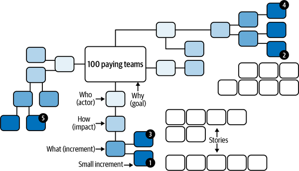
Figure 8-5. An impact map
An impact map is a type of mind map. In case you aren’t familiar with them, mind maps are hierarchical trees of ideas. You start with the core idea in the center of the map. Ideas related to that core idea branch out from the center to create their own nodes. For each of those ideas, additional ideas branch out. And so forth.
In the case of an impact map, “Why” (goal) goes in the center, followed by “Who” (actors), “How” (impacts), and “What” (increments).
To create the impact map, use your visual planning board. If you’re using a virtual board, it may have a mind-mapping function built in. If you’re using a physical board, use index cards of various colors for the nodes. That will make it easier to move them around as needed. As always, work simultaneously rather than bottlenecking contributions behind a single person.
1. Start with the goal
Start with your goal. This is the “Why” of the impact map, and it goes in the center. Your goal should relate to your team’s purpose in some way. It might be a condensed version of your mission, the next relevant mission tests, or both. In an impact map, everything stems from the goal. This is the destination your map will show you how to reach. For the Team Sasquatch example (see “AN EXAMPLE PURPOSE”), the goal might be “100 paying teams.”
2. Brainstorm impacts
Although the next level of the impact map is “actors,” it’s usually best to brainstorm impacts next. This is the “How” of the impact map. How could people outside your team help you reach your goal? How could they hinder it? How do you want their behavior to change? If you created a context diagram (see “Boundaries and interactions”), the stakeholder groups listed in that diagram might help you come up with ideas.
For example, existing customers could “recommend us on social media” or industry journals could “post positive reviews.” Be sure to include negative impacts, such as regulators who “increase auditing requirements” or competitors who “change pricing model.” Talk about how the behavior is different than today: if regulators already require auditing, the impact isn’t “require audits,” it’s “increase auditing requirements.”
3. Incorporate actors
You’re likely to end up with a broad selection of potential impacts. Discard the ones that aren’t worth pursuing or are too far in the future. For the rest, identify the actors—groups outside your team, including other groups in your company—who will create the impacts. Put them in the map at the “Who” level, between the goal and their impacts.
Take a step back and look at the whole board. Are there any important actors missing? Think of their impacts and add them to the board. Then review again. Look for missing impacts and remove impacts that aren’t relevant.
4. Prioritize impacts
Up until now, you’ve been thinking broadly and generating options. Now it’s time to focus your thinking. Which impacts are critical for meeting your goal? Which represent low-hanging fruit? Which represent assumptions that need to be tested? Choose the highest-priority impacts. In a group setting, dot voting can help (see “Work simultaneously”).
After you’ve prioritized the impacts, consider attaching concrete targets to the top impacts. For example, for the “recommend us on social media” impact, you could have a target of “100 social media recommendations per week.” This will help you understand your progress. Sometimes you’ll reach your target earlier than you expect and can switch priorities. Other times, you’ll learn that your efforts aren’t making a difference, and you need to do more to test your assumptions.
5. Brainstorm increments
Now you’re ready for the “What” of the impact map. These are your possible increments. It’s tempting to think of increments as the most important part of the map, but they’re not! The purpose of impact mapping is to focus your attention on your goal and the impacts you want to achieve (or mitigate). Increments are what you use to do so, but it’s like saying your car is the most important part of a road atlas. Necessary for the trip, yes. The map—no.
For each impact, think of ways your team could support the impact (for positive impacts), mitigate the impact (for negative impacts), or learn more about the impact (for assumptions that need testing). Keep your ideas high level. For example, to support customers recommending you on social media, you could add “automatically post screen shots” and “post celebrations.”
One way to approach increments is to think about how you can unblock a workflow or create a change in people’s behavior. “Automatically post screen shots” does both: it creates a change in behavior (more social media sharing) by unblocking a workflow (it’s a lot of work to take a screen shot, format it, open a social media app, and paste it in).
At this point, you have your high-level plan. This is a good time to take a break and get feedback. Next, you’ll break the possible increments down into the smallest valuable increments.
6. Break down increments
To break down the increments further, start by looking for opportunities to split the actors and impacts, not the increments. For example, the “recommend us on social media” impact could be split into “recommend us on Twitter” and “recommend us on Facebook.” The actor could be split into “new customers” and “existing customers.”
Finish up as described in “Breaking Down Increments”. The final result will look like Figure 8-5.
Prospective Analysis
Prospective analysis, shown in Figure 8-6, helps you generate ideas by imagining future outcomes. It’s particularly good as a risk management tool. You can use the prospective analysis as a planning tool on its own or as a lead-in to another planning approach.
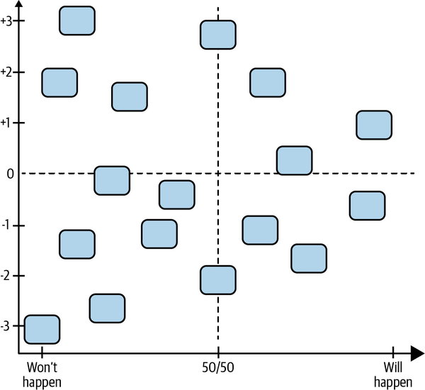
Figure 8-6. A prospective analysis
One type of prospective analysis is an Impact and Probability chart, described in Diana Larsen and Ainsley Nies’s book Liftoff: Start and Sustain Successful Teams [Larsen2016]. It’s simple and effective.
1. Create the chart
To create the chart, draw a large graph on your visual planning board or virtual equivalent. Label the vertical axis from –3 to +3, representing outcomes from “very bad“ to “very good,” and draw a horizontal dashed line at the “0” mark. For the horizontal axis, label a range from “Won’t happen” to “50/50” to “Will happen.” Draw a vertical dashed line at the “50/50” mark.
2. Brainstorm possible outcomes
Now use simultaneous brainstorming to think of what might happen in your team’s future—to the team, your stakeholders, and your software. Write each one on an index card. Be sure to think of positive results as well as negative.
Participants can add their cards to the chart immediately, or wait until the brainstorming is done. When they add them to the chart, they should position them according to the likelihood of the card happening (the horizontal axis) as well as the impact of the card happening (the vertical axis).
3. Review and refine
After the cards are on the board, take a moment to review and adjust their positions. This can be done simultaneously. The result will look something like Figure 8-6.
4. Prioritize outcomes and create plan
Next, use dot voting to choose the outcomes that are most important for your team to address. You can use these priorities as input into one of the other visualizations. If you’re using the prospective analysis as a standalone visualization, brainstorm potential increments that will help achieve positive outcomes and mitigate negative outcomes. Add them next to the chart with arrows pointing to their corresponding cards.
Finally, break the potential increments down further as described in “Breaking Down Increments”.
Story Mapping
Story maps, shown in Figure 8-7, are particularly useful for focusing attention on how your software is used.7 They can stand on their own, or you can use them to flesh out an increment created with another approach.
Because story maps describe what users actually do, it’s particularly important to include real customers and users in your planning, or at least people who understand them very well. If you can’t, improve your understanding by conducting interviews and watching people work. You’re likely to miss something important if you don’t.
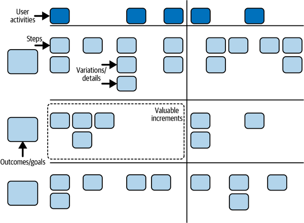
Figure 8-7. A story map
1. Determine scope
To create a story map, start by reviewing your purpose and context. Who are the users of your software? Who are the buyers who will pay for it? What are the other software systems that will interact with it? What benefits do they each get? How does that relate to your team’s purpose and the value your organization expects?
Based on that background, decide which topic, or topics, your story map will cover. You don’t need to map everything. As Jeff Patton says, “Creating a map is just telling a story.”8 Choose a beginning and an end for your story. In the case of our online shopping site example, you might choose to tell the story of what happens when someone purchases an item.
Next, decide if you’re going to create a now map or a later map. A “now” map describes what people do today. It helps you put yourself in your users’ shoes. You should usually start with a “now” map, unless you already have a good understanding of how your software will be used.
A “later” map describes what people do after they have your new software. You’ll typically convert a “now” map into a “later” map by imagining how your software will improve things. But you can also create a “later” map directly.
2. Define steps
Create your story map by literally telling the story of what happens: first this happens, then this, then that. It can cut across multiple users and systems: “I do this, then Tatyana does that, then the backend system does this other thing.”
Write each step (also called a user task9) on an index card, sticky note, or virtual equivalent. For the online shopping site example, you might create steps such as “search for item,” “read reviews,” “add to cart,” “click ‘check out’,” and so on. Put them in order from first to last.
If you’re creating a “now” map, take this opportunity to add notes about how things work in practice. Make notes about rough spots and what works well. You can also note how long steps take or how often they occur—anything that you think will be useful later, when you think about improvement.
NOTE
Story maps can take up a lot of space. If you have a physical team room, you may want to use a large wall and sticky notes rather than a whiteboard and index cards. “Super sticky” sticky notes are best for longevity—you don’t want to come in after a long weekend and find your map on the floor!
After you’ve created the steps, review the whole map from beginning to end and fill in any gaps. Then expand it. How do other people do things differently? What happens when something goes wrong? What about when everything goes perfectly? Create new sticky notes for these variations and add them in a vertical line below their corresponding step. Finally, look at your original set of steps and move any that seem like extra details below their corresponding step as well.
As you work, you’ll come up with new ideas that require you to reorganize your map. That’s healthy. When you’re done, you’ll have a horizontal line of steps that tells a story of what users do, and vertical lines of variations, alternatives, and details hanging down from that horizontal line. You should be able to “walk the map,” from first to last, choosing different steps from each column to tell different versions of the same story.
In some cases, different people will have different opinions about how to order the steps. Just choose an order that’s fairly typical. As long as you can tell a story that makes sense, the exact order of steps isn’t important.
3. Distill out user activities
Now distill the map down into user activities. A user activity is a collection of steps that go together. For example, you might group “enter billing address,” “enter shipping address,” and “enter credit card info” into a single “check out” user activity. Label each activity with a different colored sticky note above the first step in the activity. Some activities might have just one step.
4. Identify outcomes and goals
Finally, think of different outcomes or goals your users might have. Put them on additional sticky notes to the left of the map. These represent the different versions of the story that you can tell with your map. For example, you might have “quickly buy a specific item,” “browse for an item,” and “choose between several similar items.”
Order the outcomes from highest priority to lowest, then move the steps, including variations and details, so they line up with their corresponding outcome. Add additional steps as needed to tell the story of each outcome. If a step corresponds to multiple outcomes, put it in the highest priority outcome. Then draw horizontal lines to separate each outcome. (If you’re putting your sticky notes on a wall, blue painter’s tape works well.)
5. Create the “later” map
At this point, if you created a “now” map, you’re ready to change it into a “later” map. Look at the activities and outcomes and think about how your software can make them work better. Add new sticky notes, in a different color, that describe what should be added, changed, or removed.
As you think about each change, try playing the “good-better-best” game. For each change, ask, ”What’s a good enough way for users to do this?” “What’s a better way?” “What’s the best way?” Each idea gets its own sticky note. This will give you a set of trade-offs to choose from when deciding on increments and adapting your plans.
When you’re done, take a break and get feedback from team members, users, and other stakeholders who didn’t attend.
6. Divide into increments
Now that your story map is complete, you’re ready to think about breaking it into valuable increments. Start by looking at the user activities (the top row). Can you divide them up to form multiple valuable increments? You won’t always be able to do so, but if you can, draw vertical lines to group the activities into increments. Make sure each is valuable and releasable on its own.
For example, if the activities in your online shopping map were “find item,” “check out,” and “track shipment,” you could create two increments: “find item + check out” and “track shipment.”
Next, look at the outcomes (the horizontal lanes). Which of these can be released separately? Sometimes, each outcome represents a valuable increment. You might even be able to split the steps in an outcome into multiple increments. At other times, you’ll group multiple outcomes together to form an increment. Draw boxes around the increments. The result will look something like Figure 8-7. This is another good opportunity to take a break and get feedback.
7. Play the planning game
The resulting boxes are your smallest valuable increments. Next, you’ll use the planning game to refine them further. The “later” steps, details, and variations in each box are the stories you’ll take into the planning game. When you’re done, put the resulting stories back into your story map.
Iterating the Visual Plan
Whichever visualization you choose, update and improve it frequently. The product managers I’ve known are constantly looking at and tweaking their plans. One put his cluster map in a shoebox and carried it with him everywhere. (He used binder clips to group the cards into clusters.) He was constantly spreading it out in meetings and making little changes.
At the very least, check in on your plan every week. As the team finishes stories and increments, check your planning horizons and pull out more detail, as described in “How to Create Your Plan”.
Questions
What if we have to use a corporate tool that doesn’t allow us to make our own visual plans?
Don’t let your tools prevent you from making and customizing your visual plan. If you’re required to use a restrictive tool, treat it as another view into your real plan, as described in “Corporate Tracking Tools”. It’s wasteful to duplicate effort, of course, but a good visual plan is so valuable, it’s worth it.
How do we convert our visual plan into a format that our organization and stakeholders want to see?
There are a variety of options depending on how much detail your organization needs. See “Roadmaps”.
Prerequisites
Visual planning requires a team room designed for collaboration. For a virtual team room, this requires a virtual whiteboard tool. For a physical team room, it requires a large table, magnetic whiteboard, and index cards or sticky notes.
Don’t use Agile Lifecycle Management tools or issue tracking tools for your plan. They’re anything but Agile. They’re built for the whims of big Cargo Cult Agile companies and will harm your agility. You need the ability to make and customize freeform visualizations without being constrained by a tool. A whiteboard, or virtual whiteboard, is the best way to do so.
For in-person teams, a physical map is much more effective than a virtual one. Their tactile, large-scale nature connects with our brains in a way screens just can’t. It’s hard to appreciate how much of a difference this makes until you’ve experienced it. Make an extra effort to use a physical board and cards.
Visual planning also requires the leadership of people with product management and customer skills. Without their participation, you can still create a visual plan, but it may not be a good plan. A clear purpose is also essential.
For best results, include key stakeholders and real customers in your planning sessions, or at least solicit their feedback on your draft plans. Without feedback, you run the risk of tunnel vision. You could build something that seems right to you, but doesn’t actually fulfill people’s needs.
Indicators
When you create and communicate a visual plan well:
-
Stakeholders and team members not only understand what will be done, they also understand why it will be done.
-
The relationships between the parts of your plan are easy to see.
-
Stakeholders and team members contribute new ideas as a result of their deeper understanding of context.
Alternatives and Experiments
You can start experimenting with this practice right away. Try each of the maps described here, mix and match, and include your own ideas. There’s no right answer, so experiment with as many ideas as you can find or think of. Don’t be afraid to change things up, either; I change my visualizations every few months, and it always gives me new insights and fresh excitement for possibilities.
There are many ways of visualizing plans. One startup I worked with created a chart of business priorities in four categories (“business development,” “cost control,” “risk mitigation,” and “improving capacity.”) Each idea got an sticky note that was ordered by priority. There were hundreds of ideas and only a few were labeled as top priorities. The rest were constantly moving around as the startup founders came up with new ideas and reconsidered old ones.
Another team had a lot of small date-based commitments. The team created a commitment calendar with a column for each week. Cards representing the commitments due each week were put in the corresponding column. Every week, the team reviewed upcoming commitments and included them in that week’s task planning.
There are many more options available. Experiment freely!
Further Reading
Impact Mapping [Adzic2012] is the definitive guide to impact maps. It’s a short, easy read that’s chock-full of useful advice. If you’re using impact maps, it’s well worth getting.
User Story Mapping [Patton2014] is the definitive reference for story mapping. It’s an engaging read with a lot to say about stories and planning in general.
Innovation Games [Hohmann2006] has a large number of exercises to help you visualize and create your plans. Check it out when you’re ready to customize the visualizations in this book.
6 Many thanks to Gojko Adzic for his suggestions for this section.
7 Many thanks to Jeff Patton for his suggestions for this section.
8 Via personal communication.
9 Jeff Patton used the term “user tasks” in [Patton2014], but he’s since switched to “steps.” It avoids confusion with development tasks.